Colours and their meaning
Color theory is a science and art unto itself, which some build entire careers on, as color consultants or sometimes brand consultants. Knowing the effects color has on a majority of people is an incredibly valuable expertise that designers can master and offer to their clients.
Red (Passion, Love, Anger)
Red is a very hot color. It’s associated with fire, violence, and warfare. It’s also associated with love and passion. In history, it’s been associated with both the Devil and Cupid. Red can actually have a physical effect on people, raising blood pressure and respiration rates. It’s been shown to enhance human metabolism, too.
Orange (Energy, Happiness, Vitality)
Orange is a very vibrant and energetic color. In its muted forms it can be associated with the earth and with autumn. Because of its association with the changing seasons, orange can represent change and movement in general. Orange is also strongly associated with creativity.
Yellow (Happiness, Hope, Deceit)
Yellow is often considered the brightest and most energizing of the warm colors. It’s associated with happiness and sunshine. Yellow can also be associated with deceit and cowardice, though (calling someone yellow is calling them a coward).
Green (New Beginnings, Abundance, Nature)
Green is a very down-to-earth color. It can represent new beginnings and growth. It also signifies renewal and abundance. Alternatively, green can also represent envy or jealousy, and a lack of experience.
Blue (Calm, Responsible, Sadness)
Blue is often associated with sadness in the English language. Blue is also used extensively to represent calmness and responsibility. Light blues can be refreshing and friendly. Dark blues are more strong and reliable. Blue is also associated with peace and has spiritual and religious connotations in many cultures and traditions (for example, the Virgin Mary is generally depicted wearing blue robes).
Purple (Creativity, Royalty, Wealth)
In ancient times, the dyes used for creating purple hues were extracted from snails and were very expensive, so only royals and the very wealthy could afford them.
Black (Mystery, Elegance, Evil)
Black is the strongest of the neutral colors. On the positive side, it’s commonly associated with power, elegance, and formality. On the negative side, it can be associated with evil, death, and mystery. Black is the traditional color of mourning in many Western countries. It’s also associated with rebellion in some cultures, and is associated with Halloween and the occult.
White (Purity, Cleanliness, Virtuez)
White is at the opposite end of the spectrum from black, but like black, it can work well with just about any other color. White is often associated with purity, cleanliness, and virtue. In the West, white is commonly worn by brides on their wedding day. It’s also associated with the healthcare industry, especially with doctors, nurses and dentists. White is associated with goodness, and angels are often depicted in white.
Gray (Moody, Conservative, Formality)
Gray is a neutral color, generally considered on the cool end of the color spectrum. It can sometimes be considered moody or depressing. Light grays can be used in place of white in some designs, and dark grays can be used in place of black.
Brown (Nature, Wholesomeness, Dependability)
Brown is associated with the earth, wood, and stone. It’s a completely natural color and a warm neutral. Brown can be associated with dependability and reliability, with steadfastness, and with earthiness. It can also be considered dull.
Beige and Tan (Conservative, Piety, Dull)
Beige is somewhat unique in the color spectrum, as it can take on cool or warm tones depending on the colors surrounding it. It has the warmth of brown and the coolness of white, and, like brown, is sometimes seen as dull. It’s a conservative color in most instances, and is usually reserved for backgrounds. It can also symbolize piety.
Cream and Ivory (Calm, Elegant, Purity)
Ivory and cream are sophisticated colors, with some of the warmth of brown and a lot of the coolness of white. They’re generally quiet, and can often evoke a sense of history. Ivory is a calm color, with some of the pureness associated with white, though it’s a bit warmer.
However
Rainbows in Art History: A Symbol of Hope for a Better Future
Rainbow: Legends and Myths
Rainbows are formed when light passes through raindrops. They are an optical illusion created by the refraction and reflection of light. It is because of their colorful and unique display that rainbows have generated countless legends and myths across cultures. Among the most popular is the Irish folklore that leprechauns store their pot of gold at the end of a rainbow. As a natural phenomenon, rainbows can only be seen if you are in the right place at the right time. If you have ever seen one, consider yourself lucky.
What Is a Rainbow?
Visible light is made up of various wavelengths and each wavelength appears as a different color: red, orange, yellow, green, blue, indigo and violet. Contrary to how they appear, rainbows are not located at a specific place, the location is relative to the person. This means that you cannot chase rainbows and there is no pot of gold at the end. Nevertheless, rainbows have fascinated artists both as a natural wonder and as a symbol of hope in the transience of life.
Rainbows in Art History
Rainbow over a Cathedral by Constable
Constable’s Salisbury Cathedral from the Meadows was first exhibited in 1831. At the time he was grieving the loss of Maria Bicknell, his beloved wife, and mother of his seven children. The couple had spent part of their honeymoon in Salisbury. The town was also the home of Constable’s best friend, the Archdeacon John Fisher. The painting’s turbulent sky has been interpreted as a reflection of Constable’s tragic loss and the perfect rainbow as a symbol of hope and happy memories.
When the painting was first exhibited, it did not include a rainbow. Constable added it later to commemorate his friendship with Fisher, who died in 1832. Constable was highly interested in meteorology and learned the science behind rainbows from his mathematician friends. Rainbows can be dated very precisely based on their position in relation to the sun. This one would have graced the sky on 25 August 1832, the date of Fisher’s death. In the painting, the end of the rainbow touches Fisher’s house.
John Constable (1776–1837) was one of those artists who was continuously plagued by self-doubt. He worked on the painting even after it was exhibited to increase its power and effect. Constable also wrote about the geometry of rainbows and analyzed their shapes and colors in diagrams. He believed that to truly ‘see’ something we need to understand it, and to see a rainbow properly you need to understand how it is formed
Rainbow, symbolizing happiness, hope, feeling of freedom and Awesum connection to the Universe.
Rainbows in paintings have larger than life symbolic meanings. Artists who paint Rainbows want to express so many emotions and feelings while their rainbows my have the seven colours they are each different paintings always.
The Rainbow actually connects the vast sky and the earth,a s it appears to and thus symbolizes a spiritual cohesion. Divinity, perfection, harmony, Ascension, transformation, The Chinese also believe that rainbows are Dragons connecting their wishes to the Universe.
Symbolic meaning in many cultures is Rainbows are bridges connecting between Earth, humans and the Universe, Heaven.
Conscious
What are the first colours we notice?
Yellow
Yellow, pure bright lemon yellow is the most fatiguing color. Why? The answer comes from the physics of light and optics. More light is reflected by bright colors, resulting in excessive stimulation of the eyes. Therefore, yellow is an eye irritant. Some claim that babies cry more in yellow rooms, husbands and wives fight more in yellow kitchens, and opera singers throw more tantrums in yellow dressing rooms. However, these reports have not been scientifically proven.
In practical application, bright yellow – when used in large areas, will irritate the eyes. Therefore, do not paint the walls of an office (or any critical task environment) yellow. Note: Lighter shades of yellow can be comforting and cheerful.
Also, beware of bright yellow legal pads (but this may give you a jolt and temporarily wake your brain up) and do not use yellow as a background on your computer monitor.
On the other hand, since yellow is the most visible color of all the colors, it is the first color that the human eye notices. Use it to get attention, such as a yellow sign with black text, or as an accent. Have you noticed yellow fire engines in some cities?
Finally, yellow is a wonderful color, the most cheerful of the spectrum. And yellow is a symbol of the deity in many global religions.
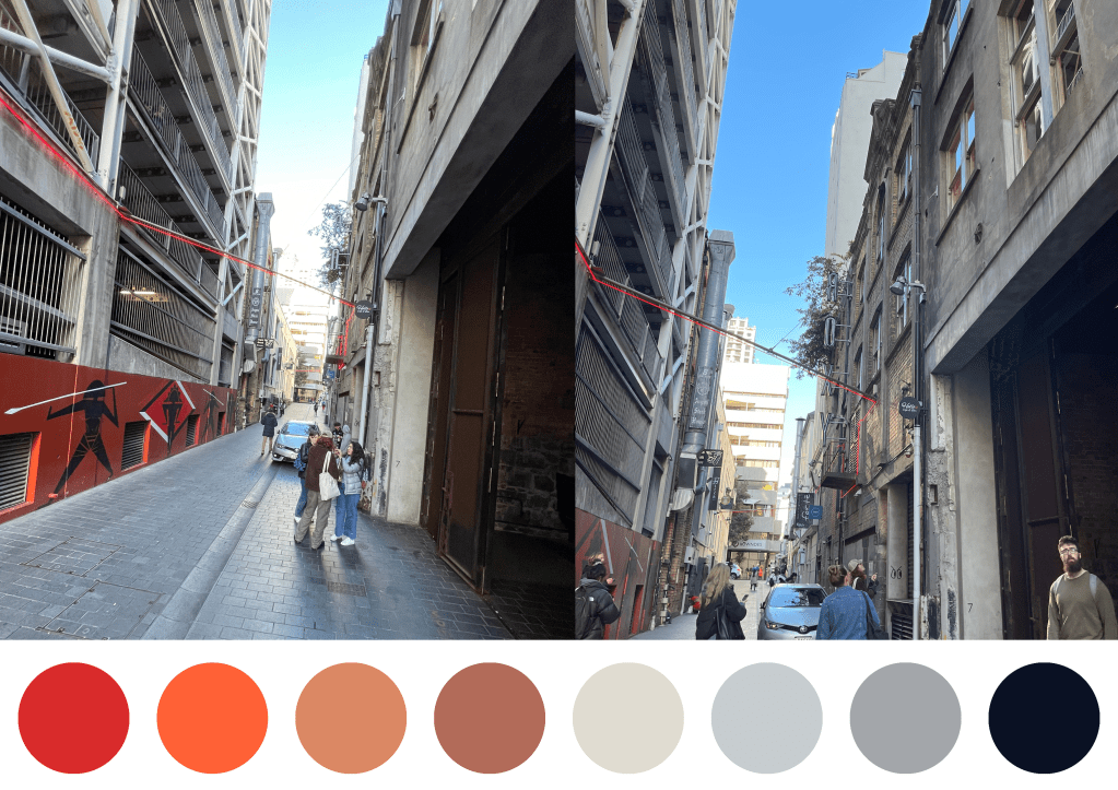
For my colour palette for my project, i have decided to take inspiration from Verner panton the idea of “escape the dreary, grey-beige conformity, mortally afraid of colours as well as a reference to my interests
However, after researching about colours, the colours I have decided to go with for my project that are relevant to my work are:
Orange
Yellow
Green
Purple
Cream and Ivory
Since I figured using one colour wasn’t as effective for the fort lane from reading the colour palette of the site
Playing around
Amount of the glasses
Less is more
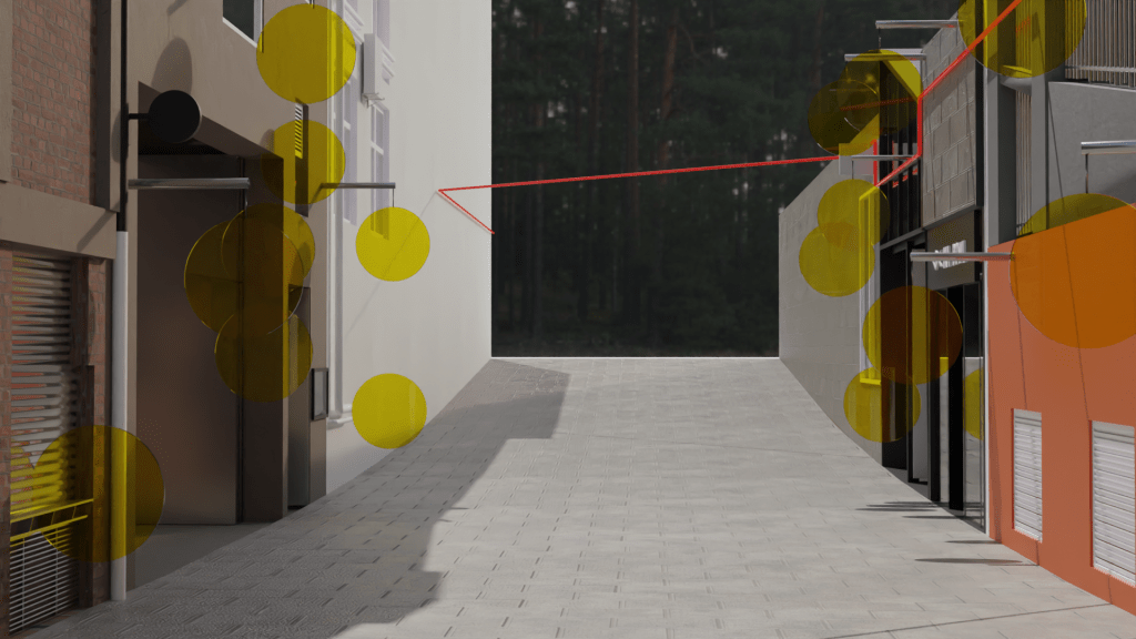
Colours

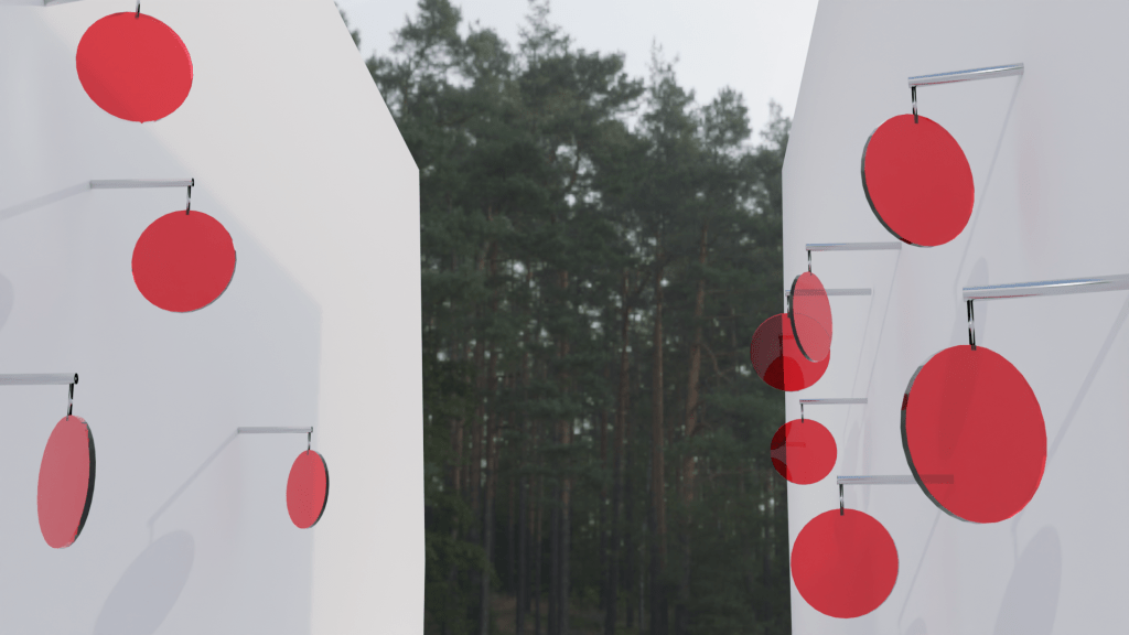
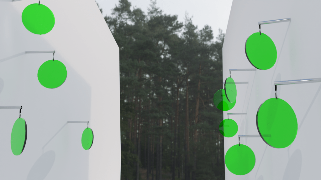
8 on each side making 16 all in all
Placement
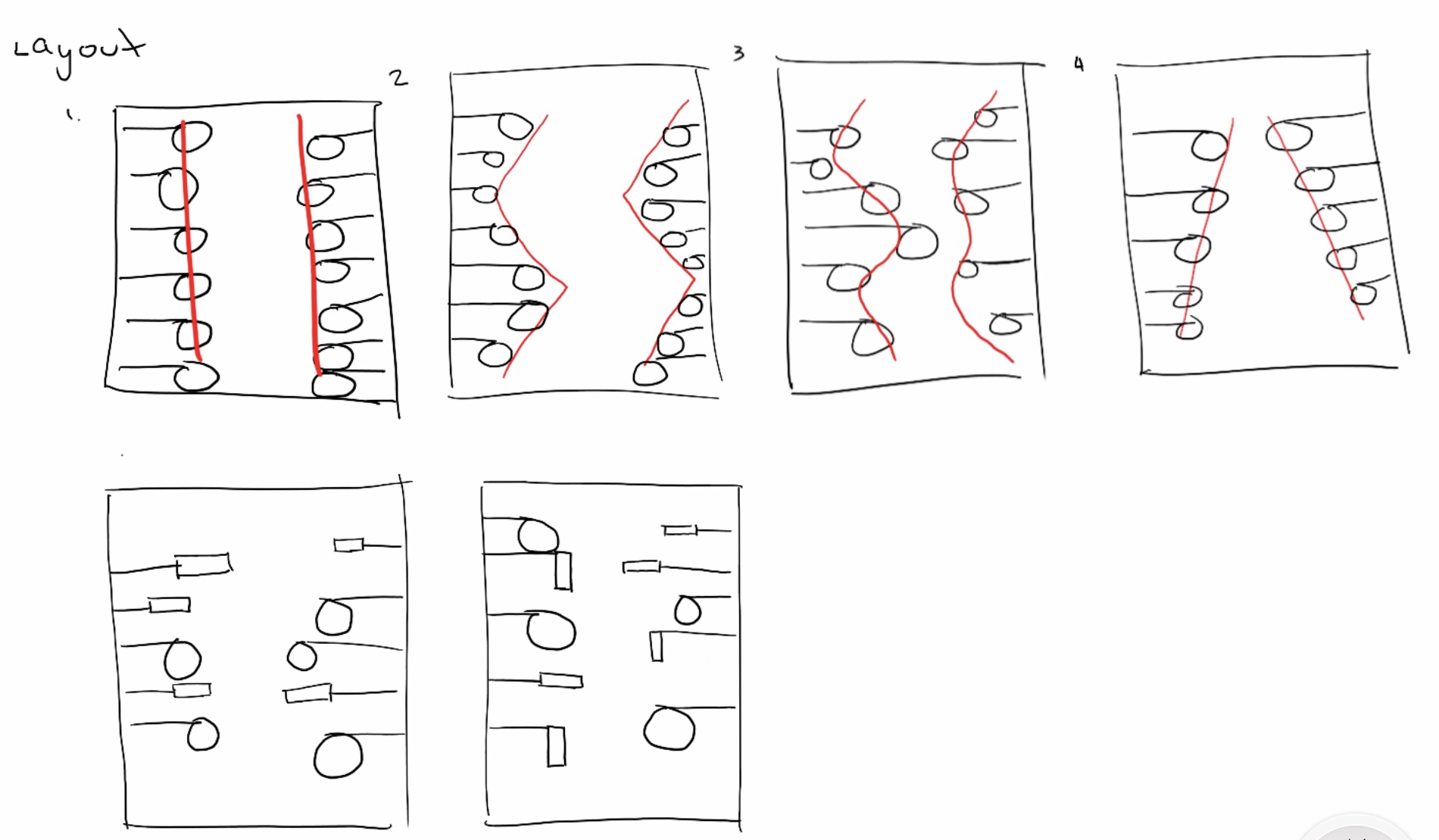
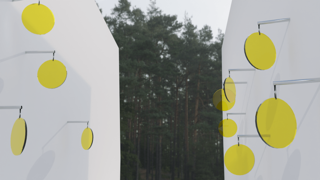
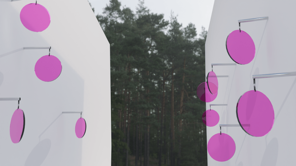
After coming to a decision of removing the pivot mechanism of the glasses I decided the best decision for the placement and rotation of the glass will be different from each other, as I didn’t really like the uniform look after making it in 3D model it also beats the purpose of what i wanted the glass reflection threshold to do/show (reflect the surface design of the buildings as a way of preserving and acknowledging the aesthetics of old buildings.
Changes:
Initially I wanted the glass to pivot to be able to rotate 360° however, I then decided that I will have them at a fixed position and rotated differently from each other. This is so that I have control on where and what the glass is reflecting, where the its shadow will most likely be and what people will see when looking through it
In order achieve the coloured shadow more effectively a few of the glass are notated horizontally and vertically
