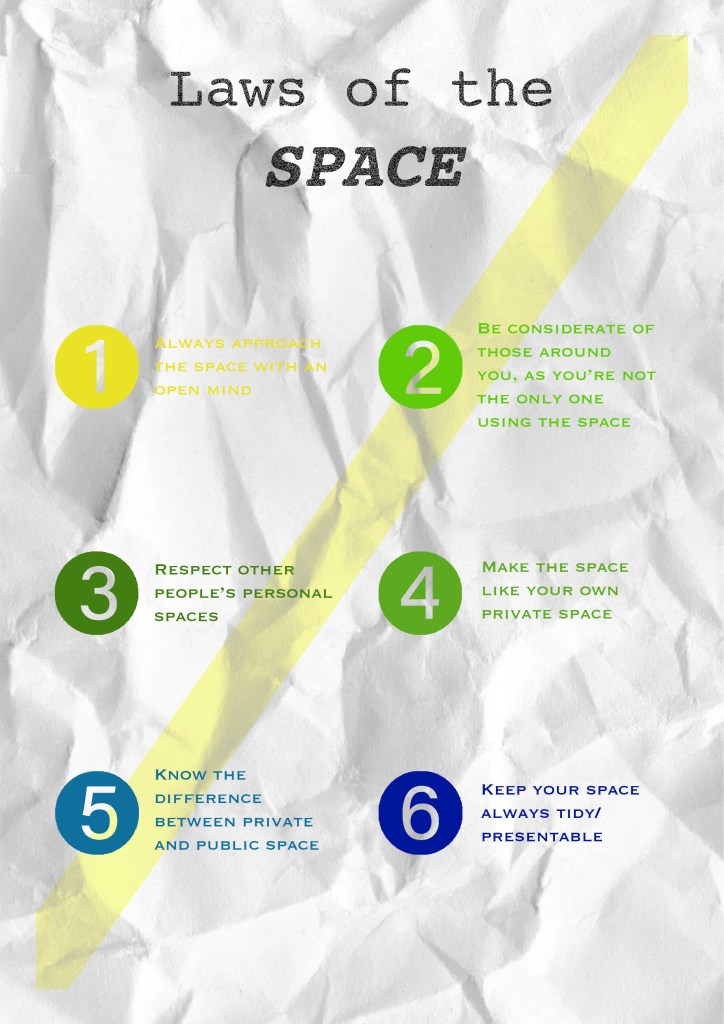
In the end I ended up choosing the manifesto below that I have made (3rd manifesto development from previous week), this is because the reason behind it represents the space/sit that I am basing my manifesto on.
- The colors – the odd colors of the carpet in the space
- The line across the page – the divider of the space
- White background – represents the sunlight that filters the place, it also makes the colorful colors pop and more visible and eye catching to the eyes

For my next development of manifesto, I think I might have to incorporate the idea of crumpled paper for my manifesto, as one of the rubbish I found in the space was crumpled paper.
I might also incorporate coffee stains
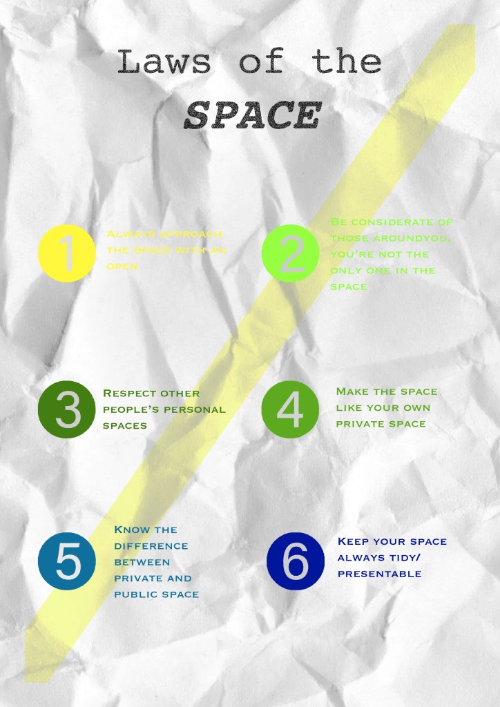
Final development:
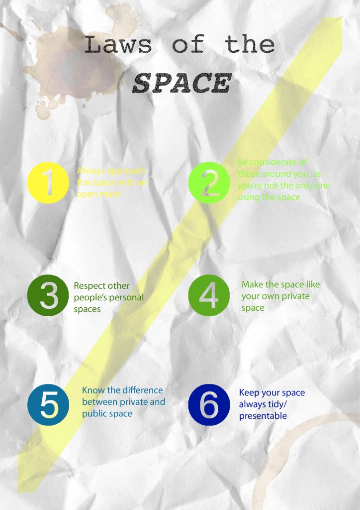
For my final one I decided to go with the all caps fonts, as it gave me more of a serious tone to it, as well as having the aesthetic look to it (cleaner and suits more with the layout of it)
Final
Idea on how to present work:
Divide your ideal space from the unwanted using a tape
For my final presentation of Part 1, I decided to miminise the number of papers and which one’s I was going to include for my final presentation. These are a few photos, gravitational pull, observations, artworks, etc
Final Presentation


