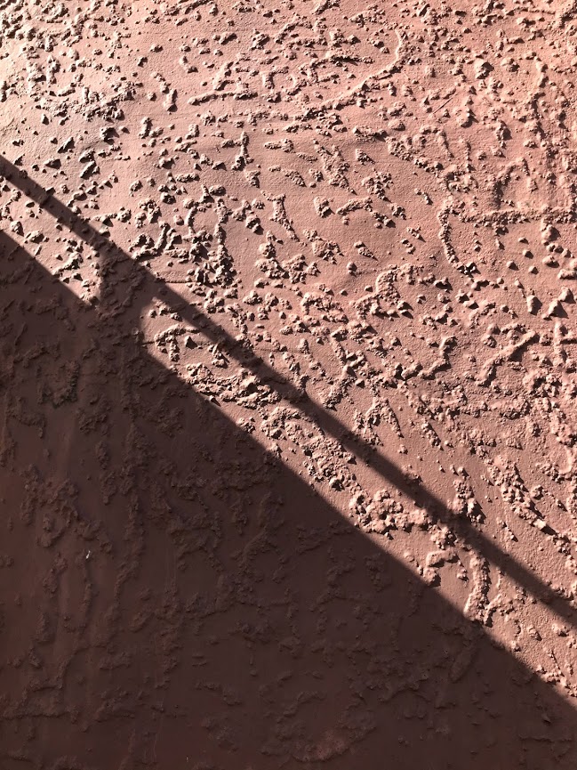
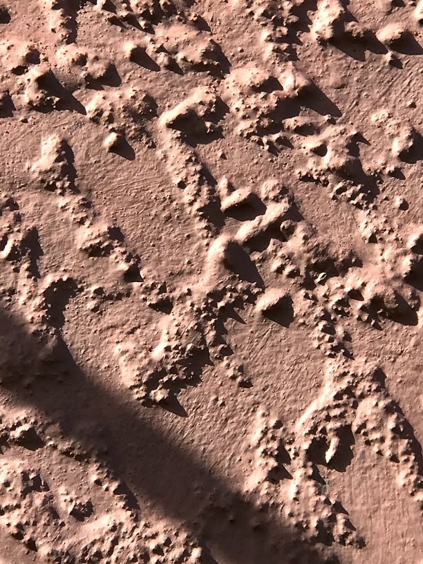
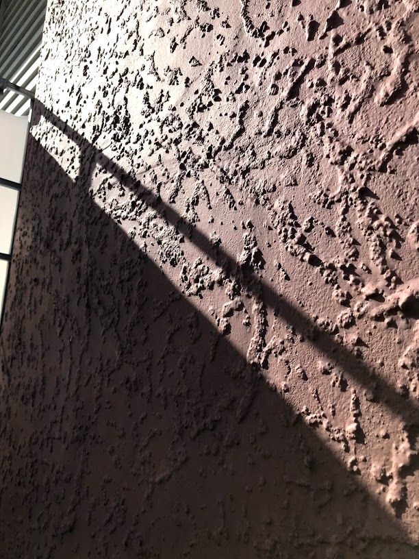

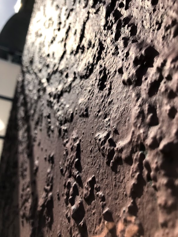
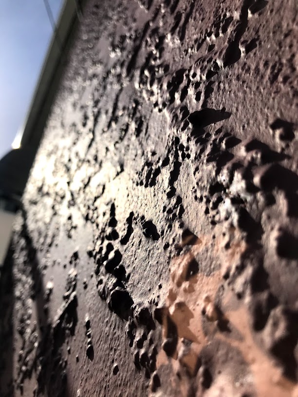
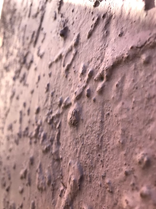
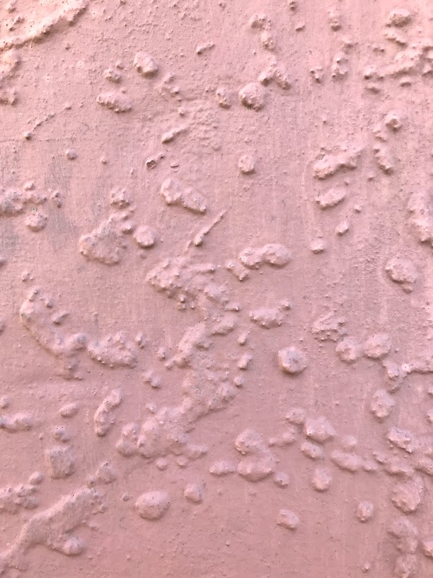
For my surface observation i wanted to pick out a surface that has more of a texture instead to a flat surface as i am currently thinking of doing this to my proposal design.
In these images you can see that the shadows of the bumps on the wall all depends on what angle you take the photo on, such as if the camera is pointed towards the sun the shadows are more define/darker. The angle of the photo also effects how the shadows will look like in the photo
These photos was taken at 11 am
Verner Panton
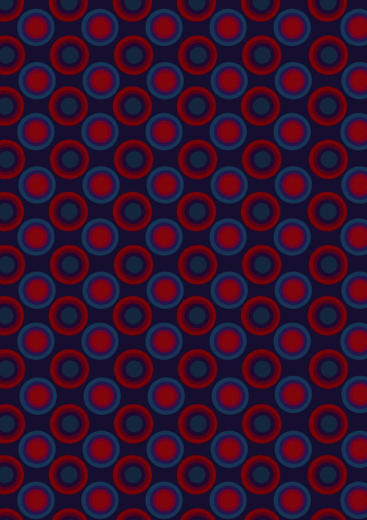
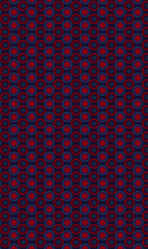
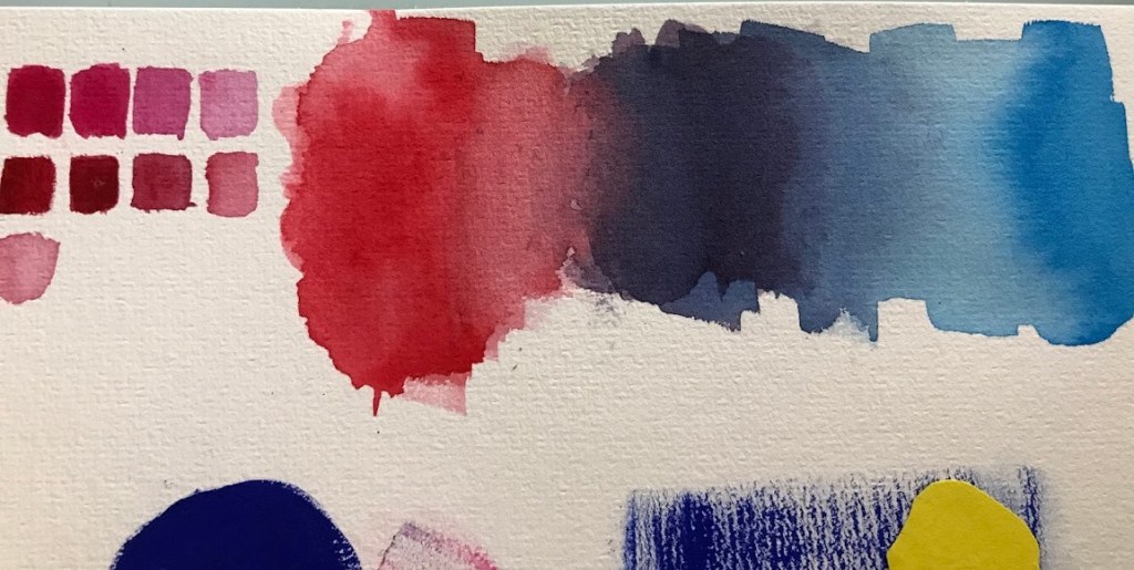
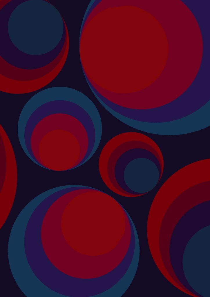
From looking at a few images of Verner’s work I have noticed that he used alot of violet’s or indigo, this gave me a slight advantage as my group seminar picked the color violet to research on and present therefore it gives me more knowledge to the color violet
I then swatched a few colors of the most common colors that Panton has used in most of his work. According from his work I have noticed that he doesn’t use any color white at all in his background, he mainly uses different shades of: violet/indigo, blue’s, orange’s, red’s and sometimes a touch of pink.
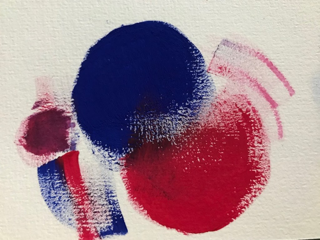
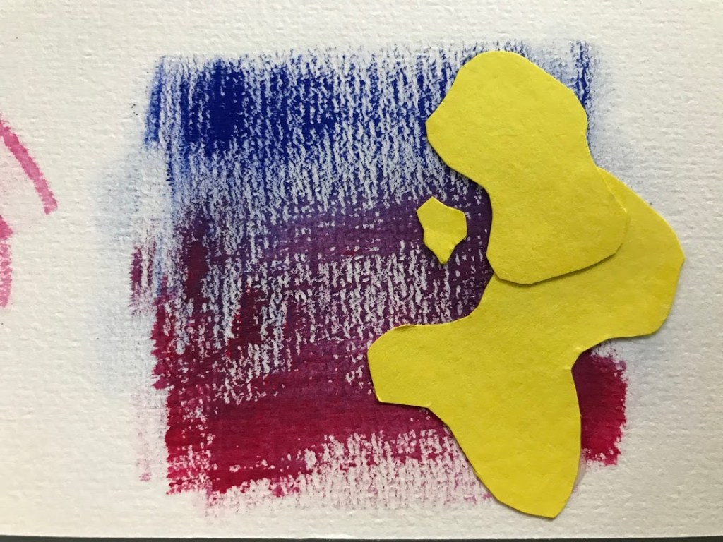
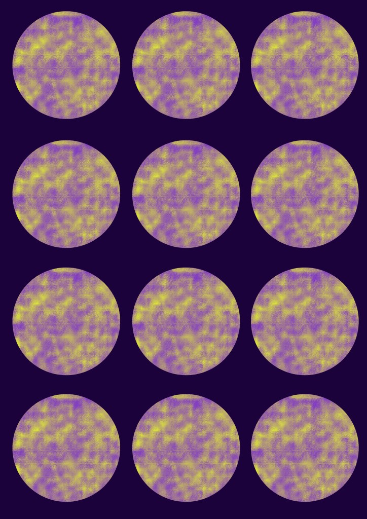
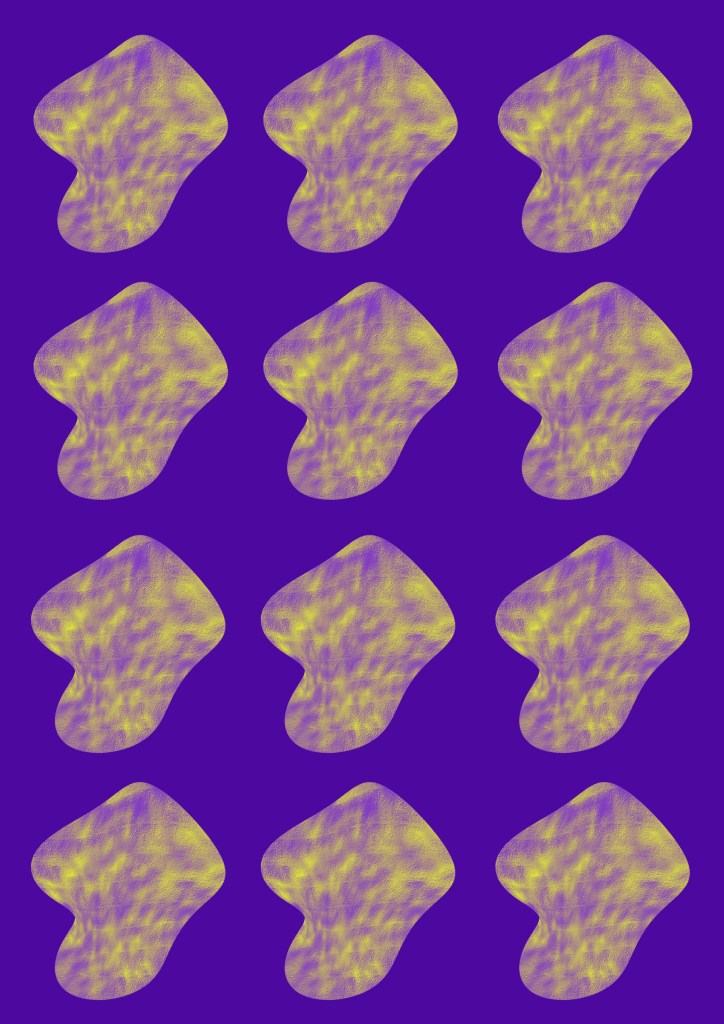
I then i created my 3 surface designs using different techniques, overlaying with cutouts, saturations using gouache and watercolor.
Colour selection
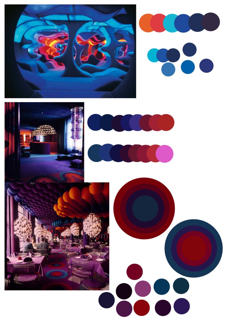
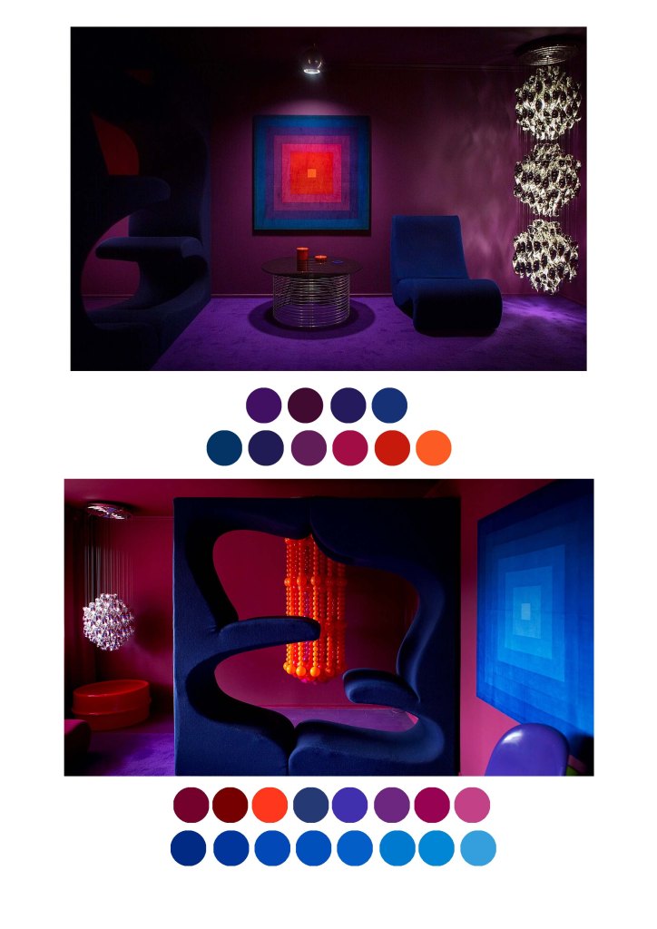
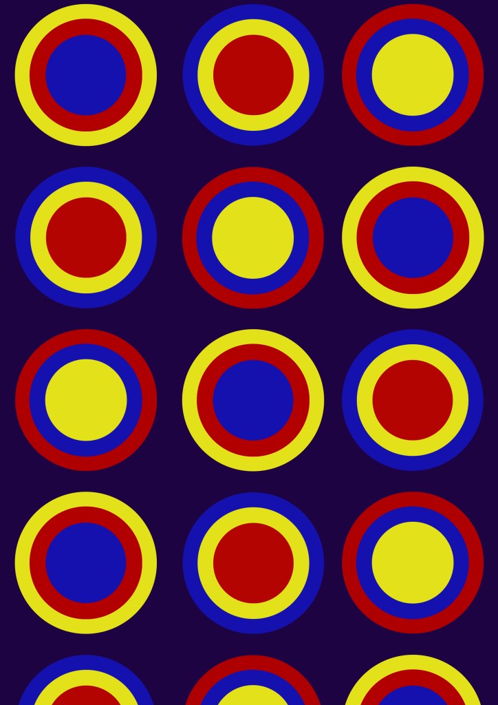
I then went to look through all of Verner Panton’s work Iand selected a few colours to make a colour palette from what i’ve noticed that he uses more often compared to the other colours
From then I created a few more series of drawings that i have created in photoshop just by looking at the color palette that Panton uses in this designs
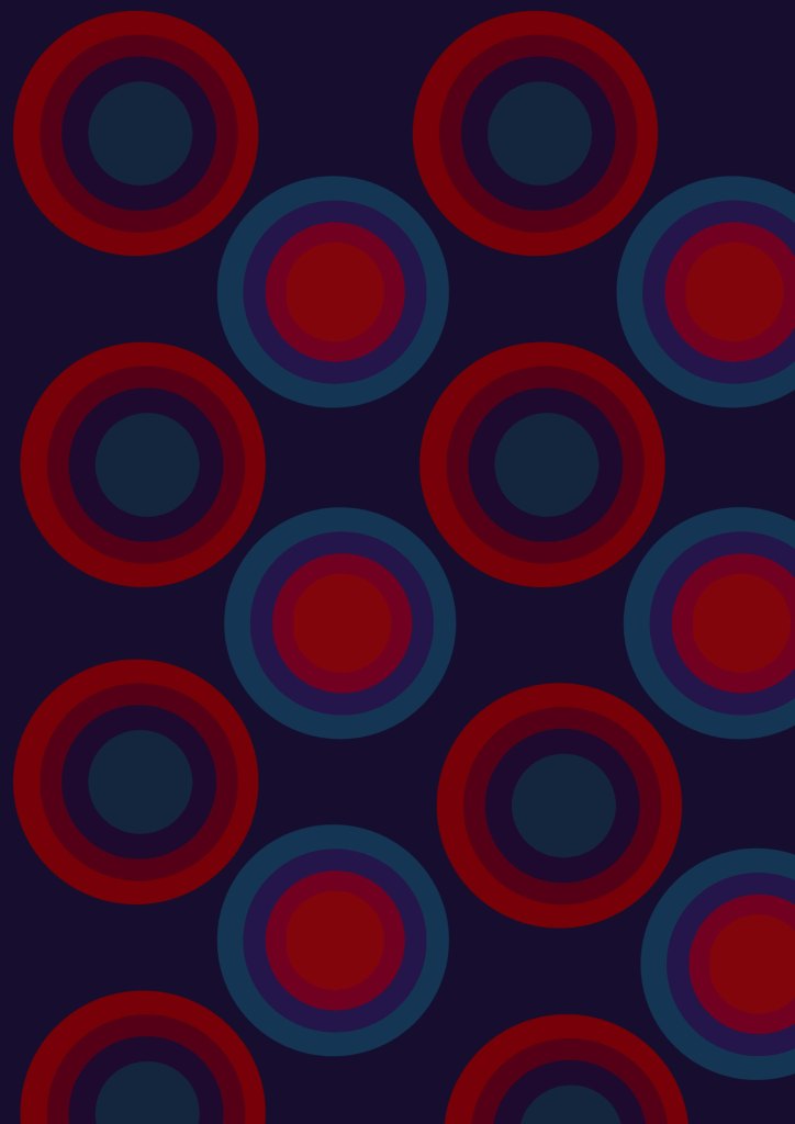

My final design