1. Find out when and where they produced their work.
Titled “Visiona 2 – Revisiting the Future”, the Vitra Design Museum in Weil am Rhein, Germany, was exhibiting Verner Panton’s 1970s’ radical visions for the future from 7 February to 1 June 2014.
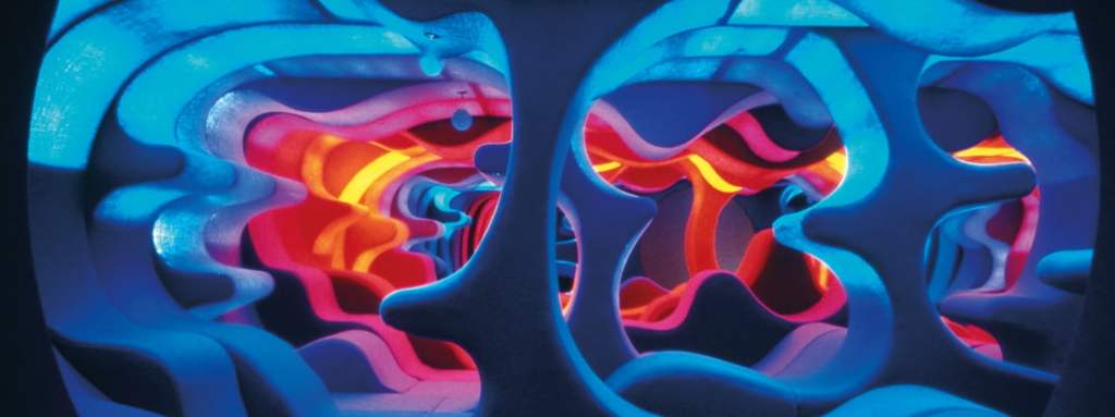
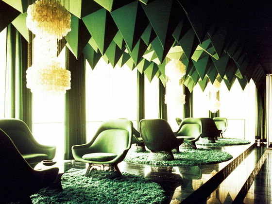
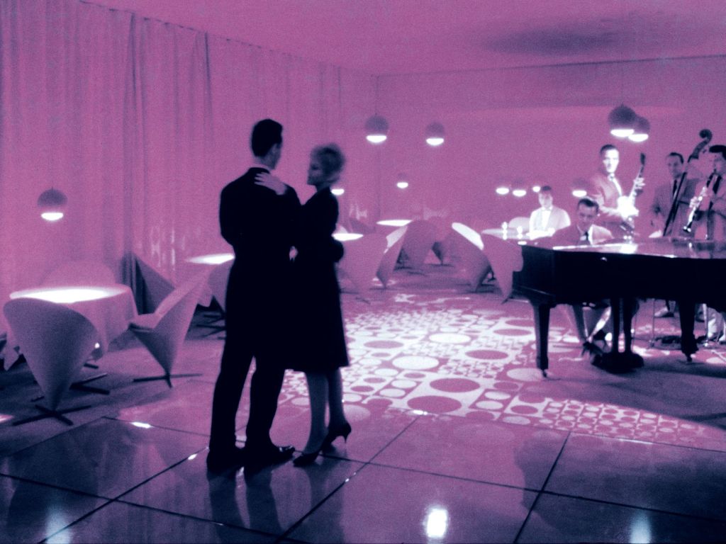
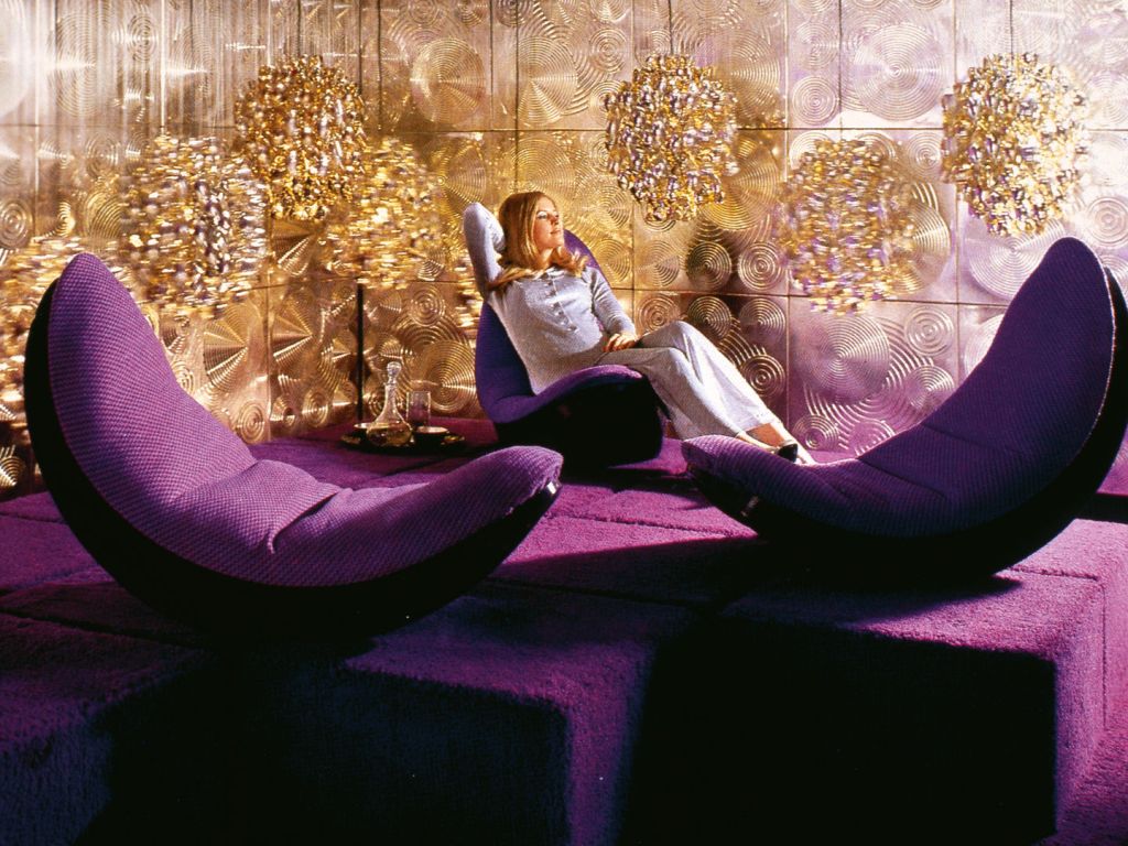
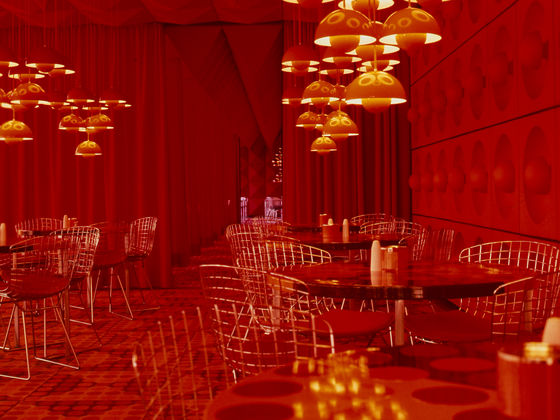
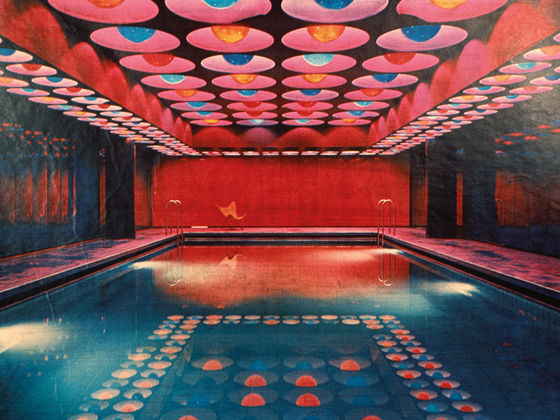
Visiona 2 (1970). A glimpse of Panton’s renowned exhibition for the Bayer textile firm, presented at the furniture fair in Cologne in 1970. The most spectacular exhibit was a 48 m2 (517 sq ft) landscape, where the visitor was literally immersed in a sea of colours and undulating forms.
2. Identify the key conceptual ideas that underpin their work.
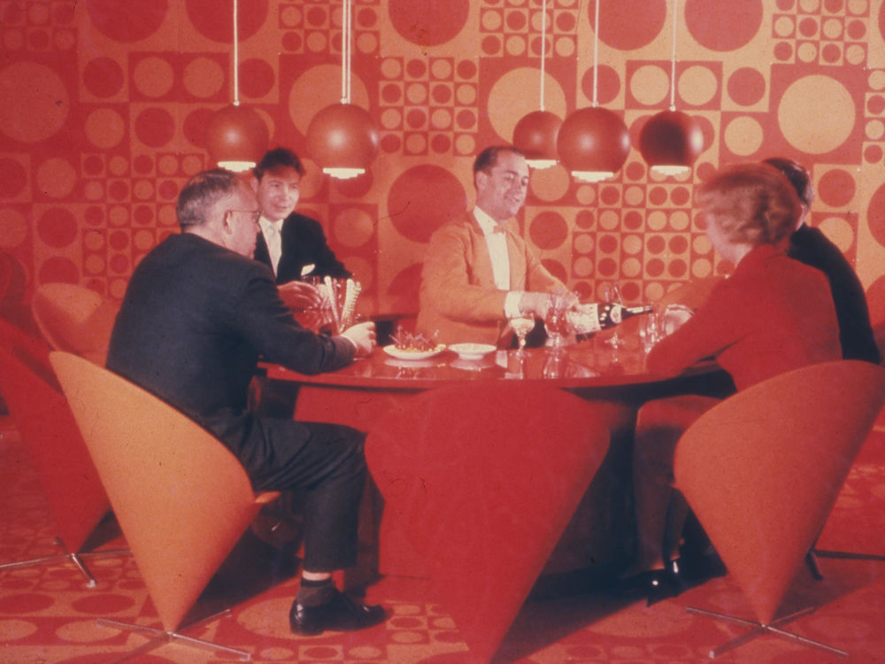
Today, most of us agree that, from an environmental perspective, we should keep plastics out of the ocean. However, only a few decades ago, one international manufacturer filled a ship with these synthetic materials and floated it down the Rhine, to advertise the new environments Danish designer Verner Panton could create from their wondrous materials.
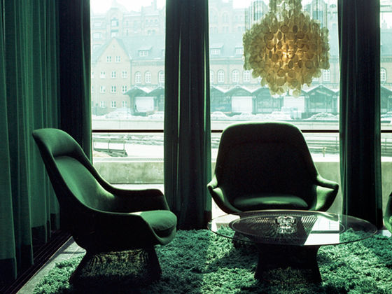
“The Visiona exhibitions were produced in collaboration with the German chemical group Bayer AG, and took place on ships floating on the Rhine in Cologne,” explains our book Verner Panton.
3. Identify their critical position on colour in relation to their work (i.e. how is colour applied, in what proportions, what particular theories about colour inform the making of the work, how does colour change dependent upon the environment in which the work is viewed.
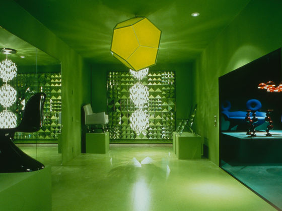
Verner Panton uses alot a wide range of colours such as matte to bright colours, coloured textiles that have been dyed and thorugh clear objects and coloured lights. In almost most of VernerPanton’s work/ design’s he tends to apply alot colours to the entire room, he will either use different colour for the wall and the roof etc or sometimes he would use an array of colours (all bright colours excepts for pastel and light colours. From what I can see from all of his work he the main colours he choose to strictly stick with are:
If not those in the shades of those 5 colours then it’s a different shades of any colours besides green ,white and brown shades.
“I am not fond of white,” Verner Panton wrote in Lidt om Farver (Notes on Colour). “The world would be a more beautiful place without it. There should be a tax on white paint.”
Panton’s color method has inspired me rethink my praxis of — or reliance upon, or addiction to—using white. Looked upon in one way, the selection of white over another color virtually represents a lost opportunity to inject a work with more depth and vibrancy.
Below is Verner Panton’s notes on colours:
“Choosing Colours should not be a gamble. It should be a conscious decision. Colours have meaning and function,” says Verner Panton. In the book “Notes on Colour”, the Danish designer collects his ideas and thoughts on colours. An extract.
“Colours are a subjective, physical perception – they really don’t exist at all. Yellow is yellow only in our thoughts. It is only the function of our eyes that creates colours. Everything in our surroundings has a color – only water (distilled) and schnapps are colourless!”
“Colourless is only what light can penetrate completely. A colour has its origin in the purely physical world. It originates in light rays being reflected from or penetrating a substance. The things we see get their colour and appearance from rays of light.
The rays of light hit an object, are reflected by or penetrate it and are picked up by the eye, Some of them are absorbed by the object thus changing the intensity and composition of the reflecting or penetrating light.”
“The perception of colour depends on the source of the light. The sun is our most important source of light. Daylight is rich in blue tones. In contrast the standard light bulb does not contain much blue or violet but has a great deal of yellow, orange and red. Sunlight has a more golden tone. When it falls on fresh snow it looks more yellowish while fresh ski tracks cast a blue shadow because of the pure light from the sky.”
“Textiles seem to have different shades of colour by daylight and by lamplight. A scarlet material seem to be intensely red by lamplight and bluish in daylight. A blue-green material seems less blue by lamplight than daylight. When an object reflects more than 80-90% of the light falling on it we perceive it as white. When it absorbs more than 95% of the light it appears black.”
4. What type of surface treatments are used in the work? Do they use matte, satin, or gloss paints or material finishes or all of them together? Why might they do this and what is the effect of doing this?
From what I can see Verner Panton uses matte and glossy depending on the colour, the lighter the coloured lights tends to be glossier or reflective while the coloured metal lights tend to be matte. as the brighter the colour the glossier it tends to show
5. What scale are the artworks you have researched? How does scale impact on how the work is experienced and how colour and materiality are perceived?
Verner panton works on both small and large scale artworks. His smaller furniture and lighting pieces are more easily integrated into spaces
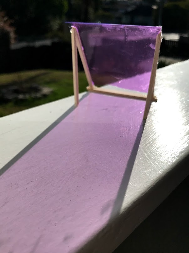
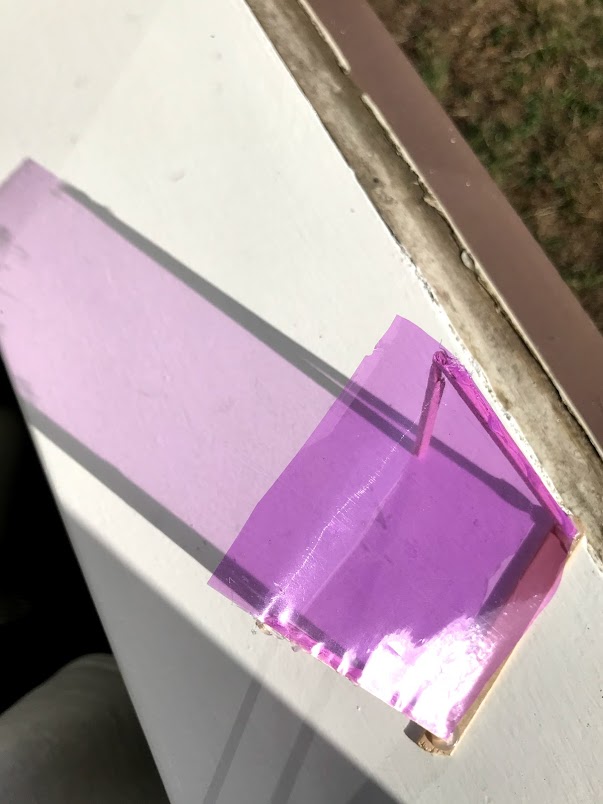
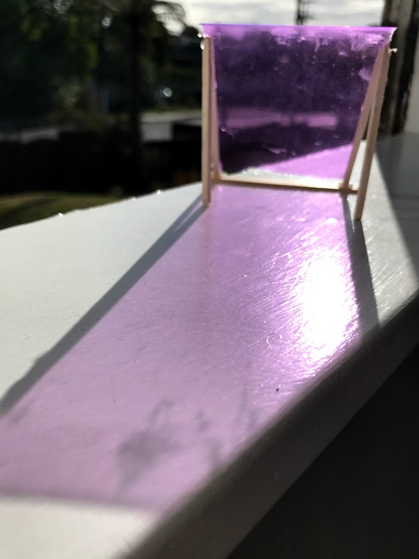
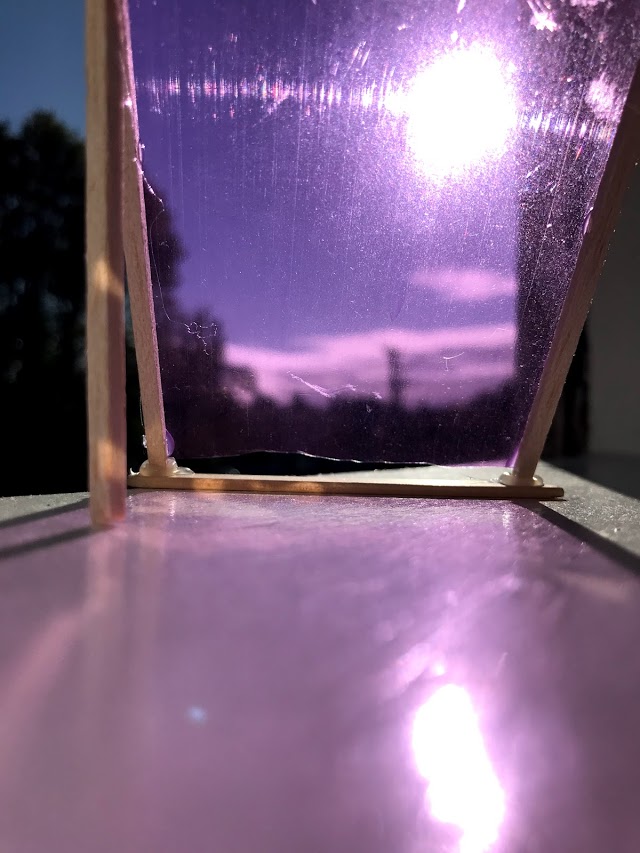
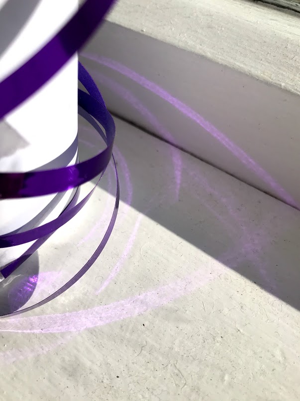
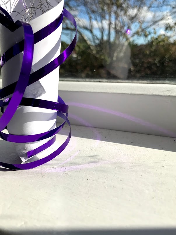
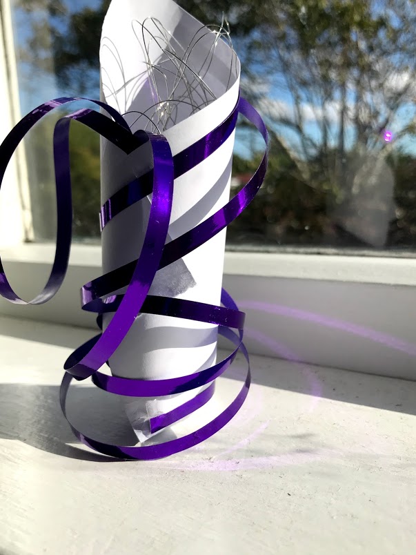
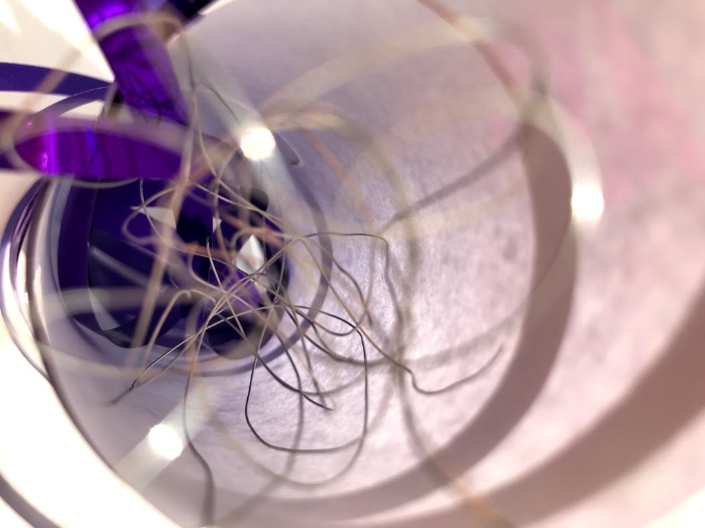
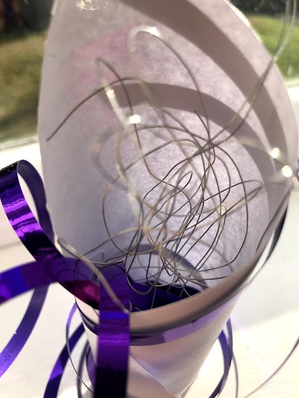
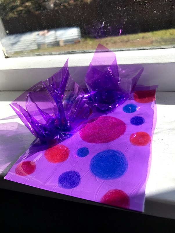
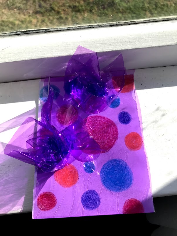
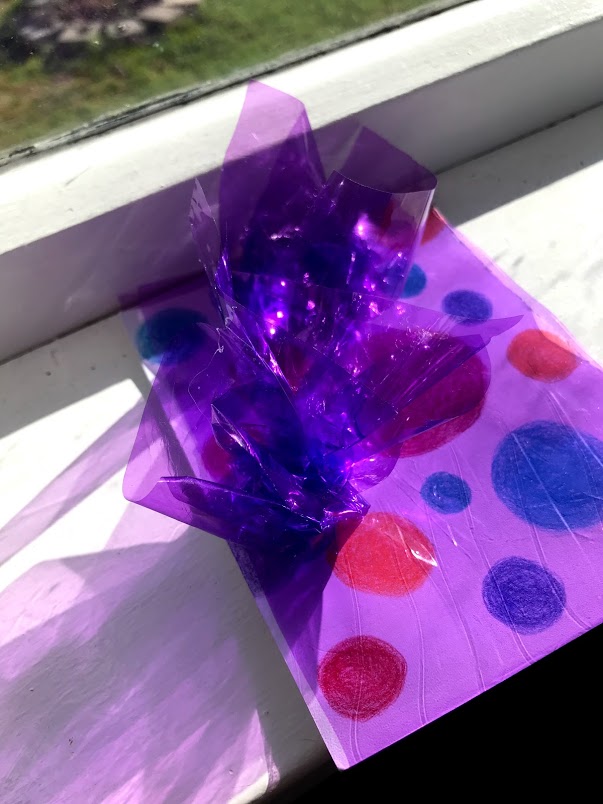
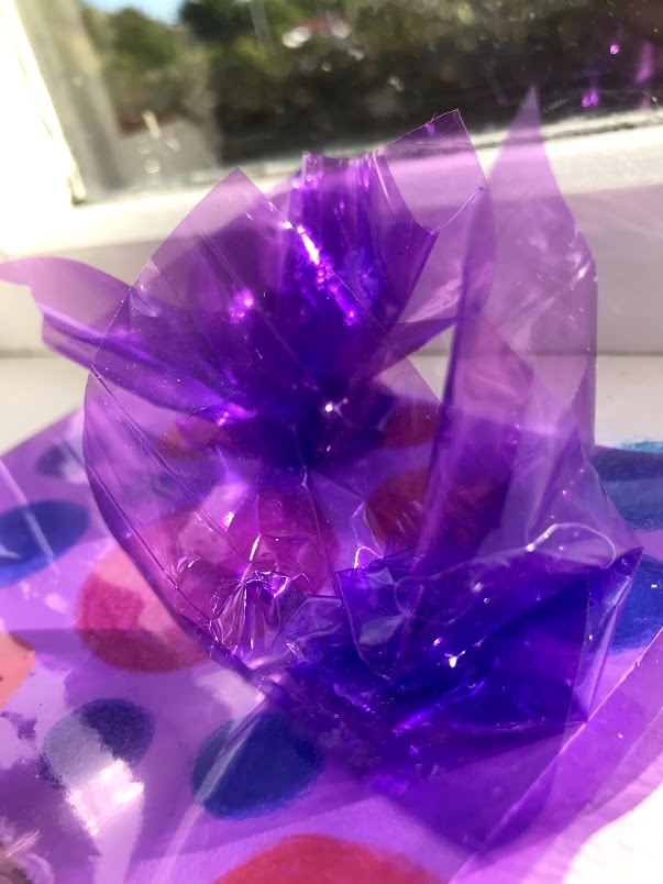
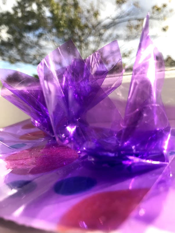
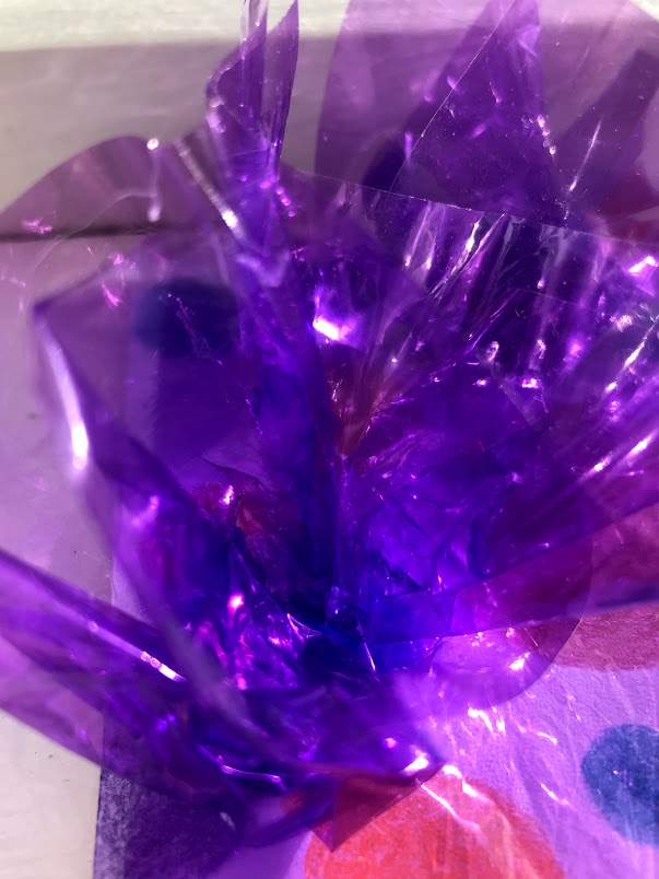
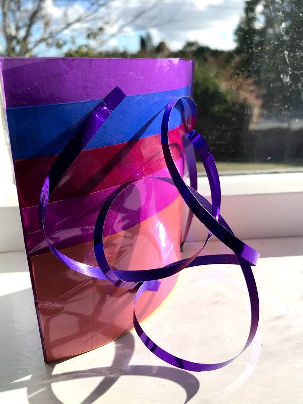
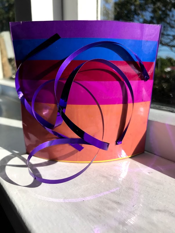
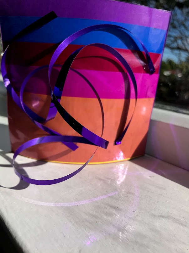
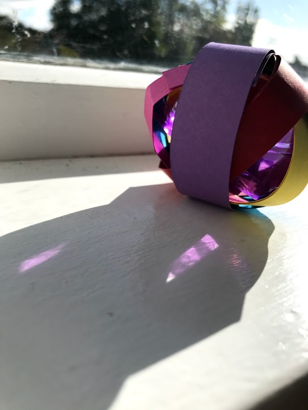
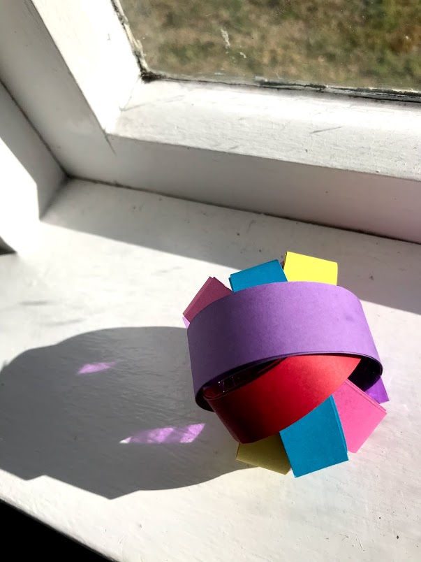
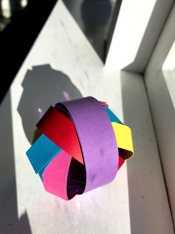
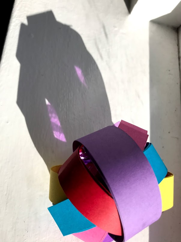
Using my artist I then came up with a few models that i have made on my own that I think Verner Panton would use
Model 1:
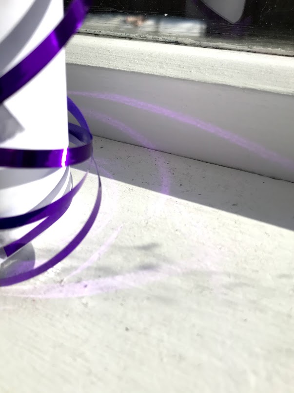
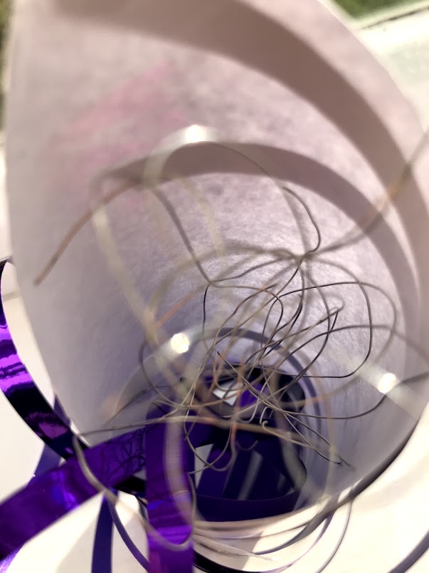
Model 2:
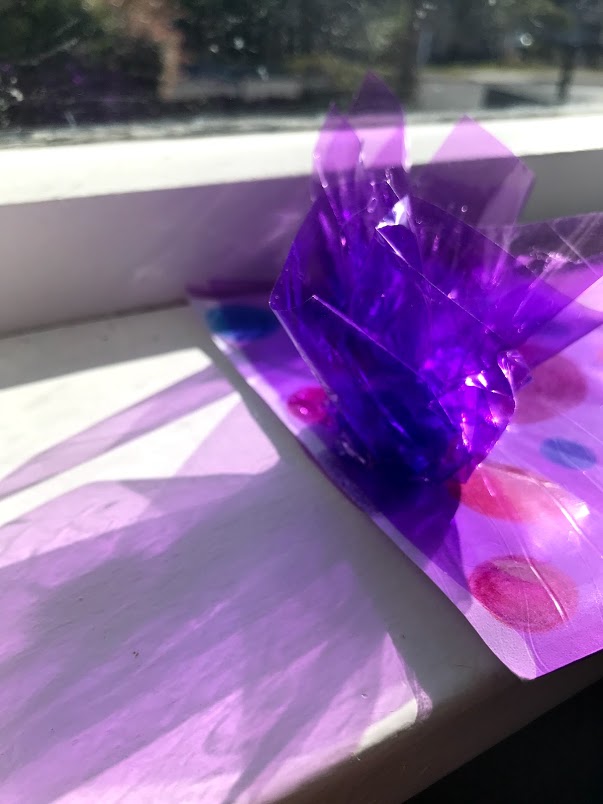
Model 3:
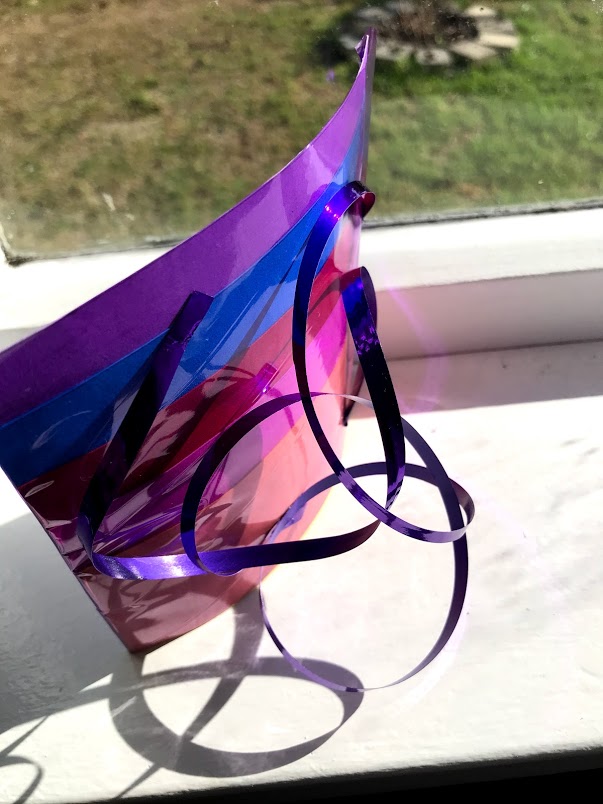

Model 4:

Model 5: