The designer that I have chosen as an inspiration throughout my project is Verner Panton.
Below are a few information that I have come across about him and some examples of his work.
https://www.verpan.com/verner-panton-x-verpan
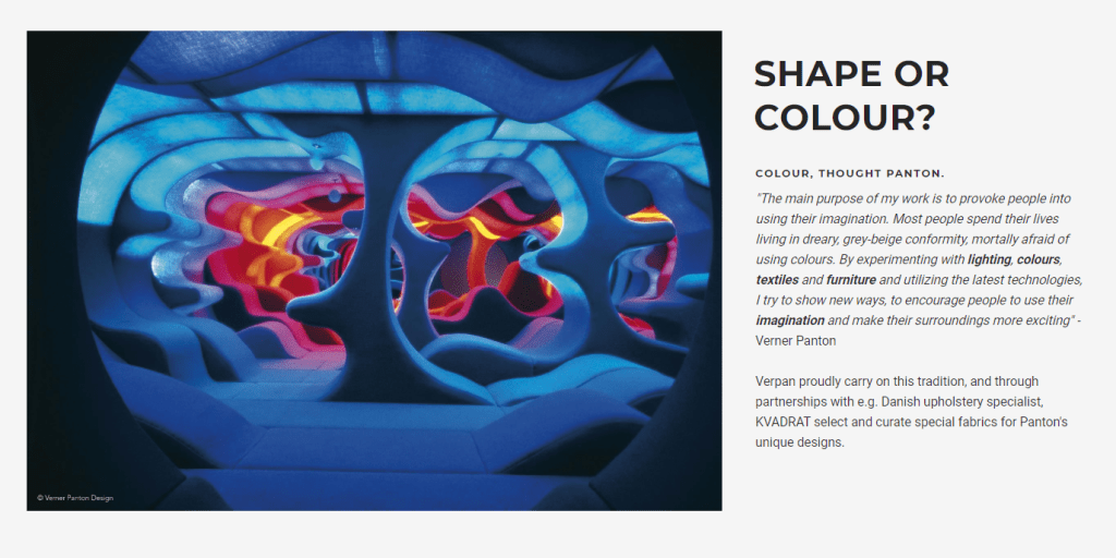
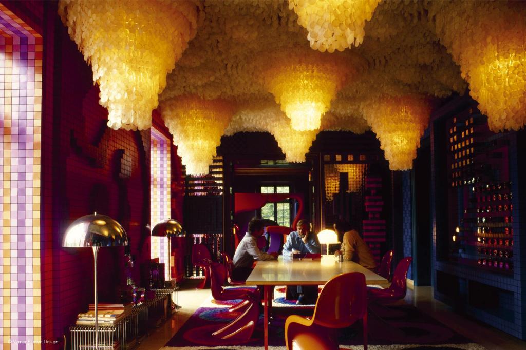
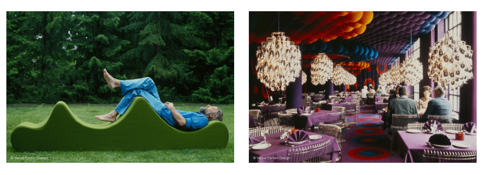
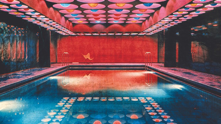
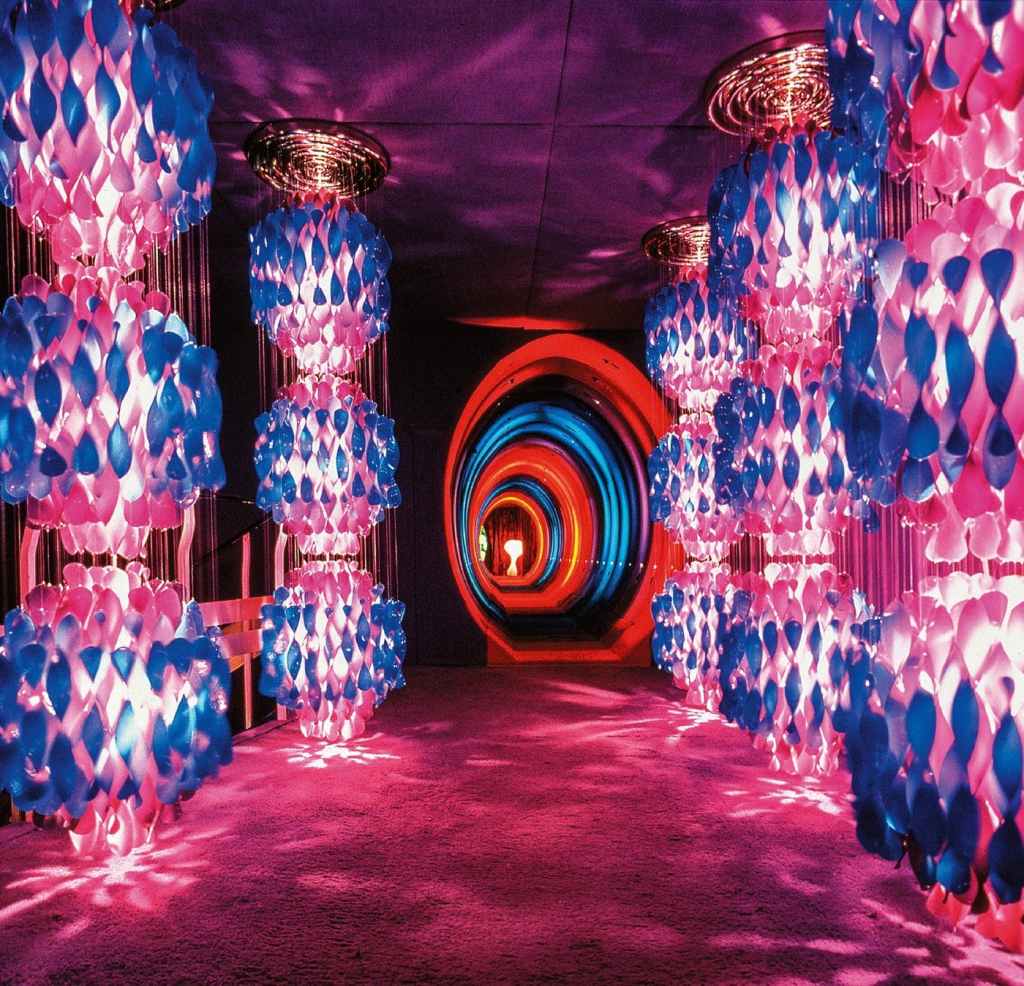
Verner Panton (1926-1998) was an inspirational and colourful personality. A unique person with a special sense of colours, shapes, light function and room.
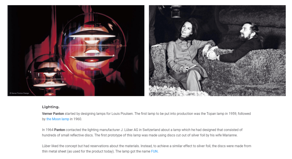
Over the course of his career, Verner Panton introduced a series of modern lamps with personalities unlike any of his Scandinavian contemporaries. With a remarkable faith in the unlimited possibilities of the form, he worked successfully to create a new set of theories about how lighting should work and how it should influence its surrounding.
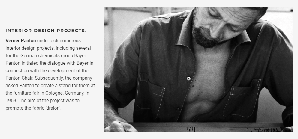
Verner Panton studied at the Royal Danish Academy of Fine Arts in Copenhagen before going on to work at Arne Jacobsen’s architectural practice. He set up his own design studio in 1955.
QUALIFIED ARCHITECT.
Verner Panton was born in the village of Gamtofte on the island of Funen in 1926. His father was a publican and innkeeper, who worked first at the inns in Haarslev and Mørkenborg and subsequently as tenant publican of the Komigen inn on the Langesø estate.
It was here that Verner Panton spent his childhood as the oldest of two brothers, from the age of 10 and following his parents’ divorce with three half-brothers. His mother left Funen with Verner’s younger brother to live on the island of Lolland. Verner Panton originally wanted to be an artist, but his father was against this so, as a compromise, Verner Panton decided to become an architect and train at the Royal Academy of Fine Arts, School of Architecture in Copenhagen. However, before commencing his architectural training he started his working life as a traditional tradesman, as a bricklayer. In 1951 he qualified as an architect.
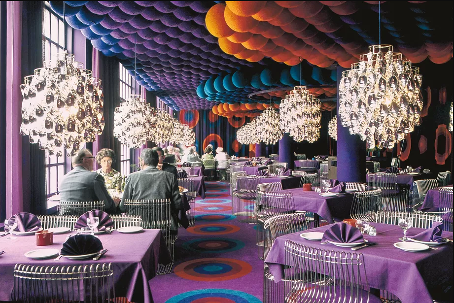
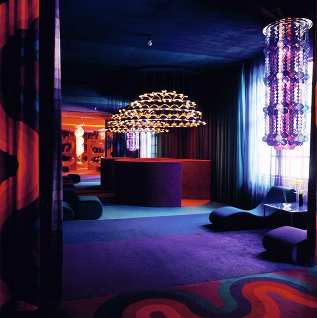
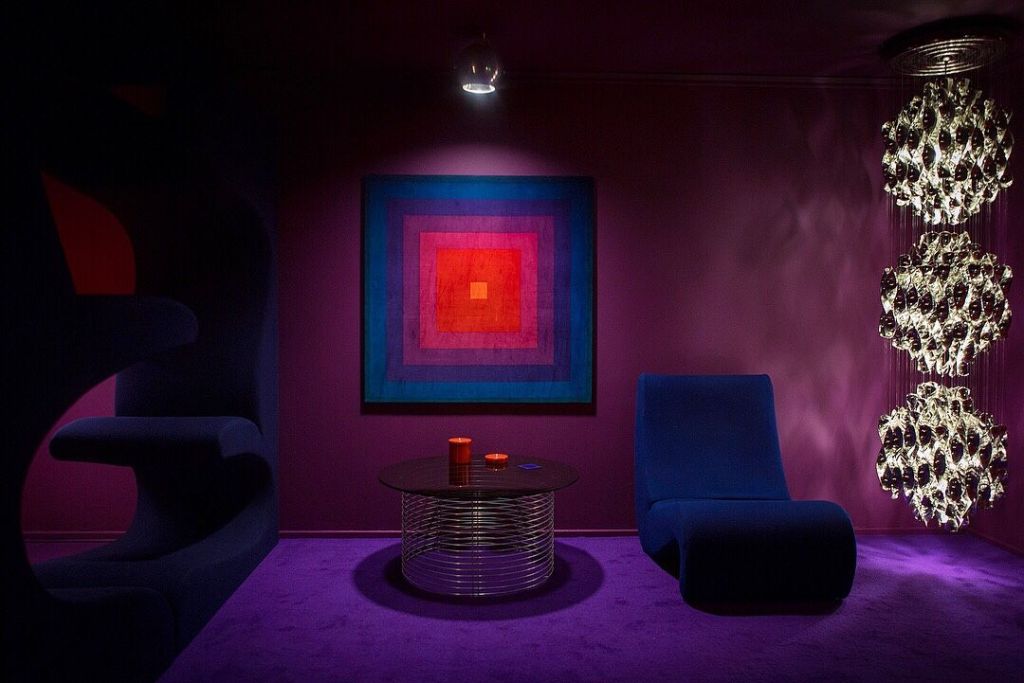
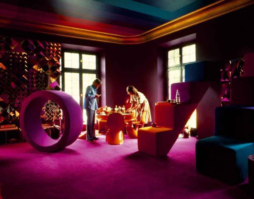
The reasons to why I chose Verner Panton as my artist was because I like the way he uses bold colours to his work as bold colours makes people happy compared to dull colours. When Verner Panton said that he wanted people to use their imagination more often as people spend their lives surrounded by dull colours.
Another reason to why Verner Panton caught my eye was because i’ve always had an eye for minimal aesthetic especially with the two colours of black and white, so with this project i wanted to step out of my comfort zone hence to why i chose Verner Panton.
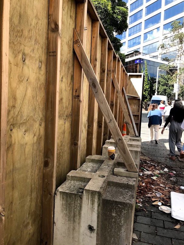
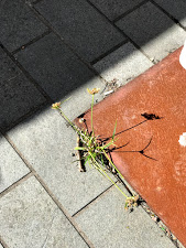
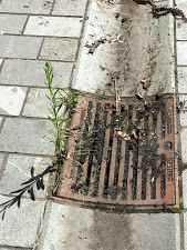
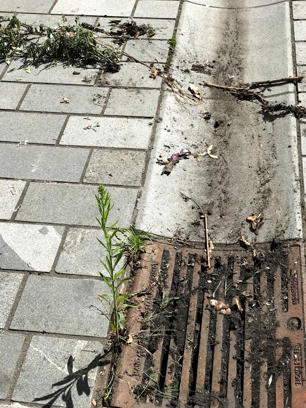
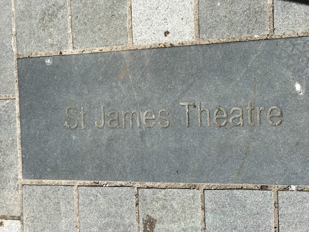
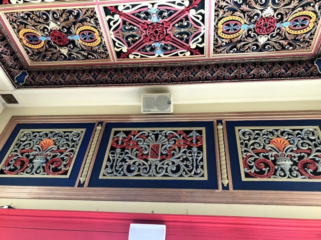
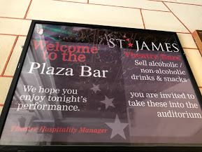
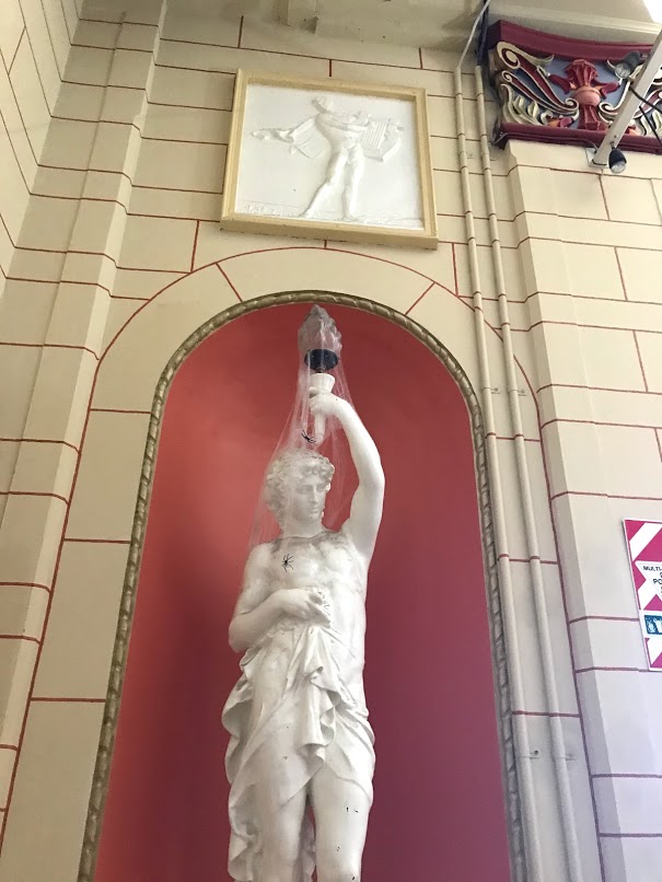
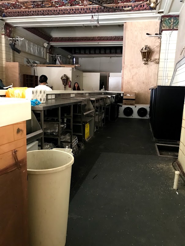
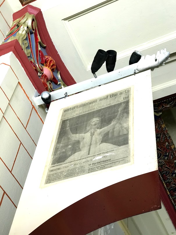
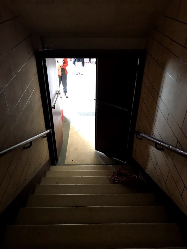
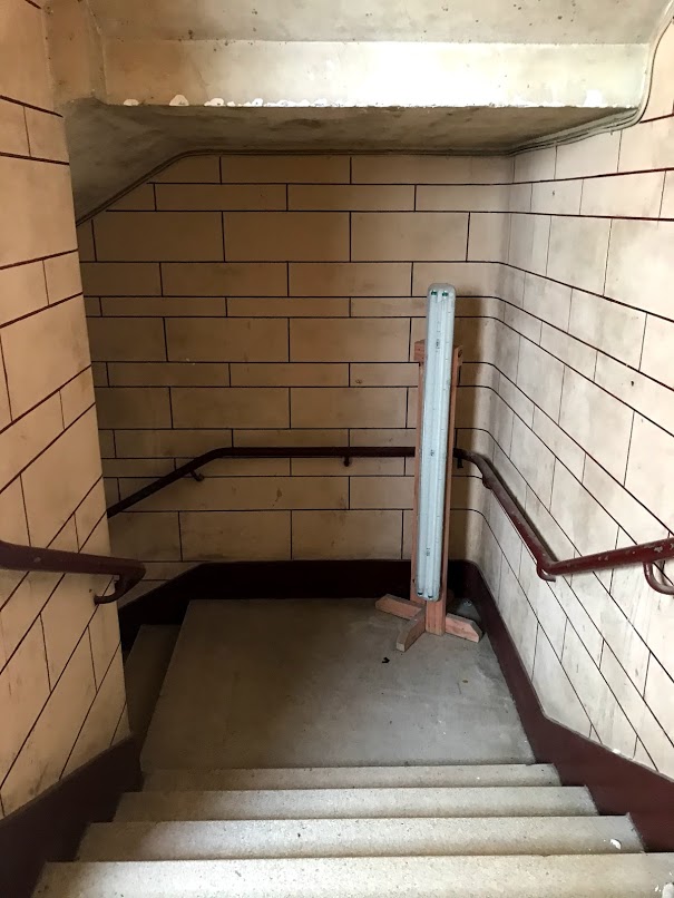
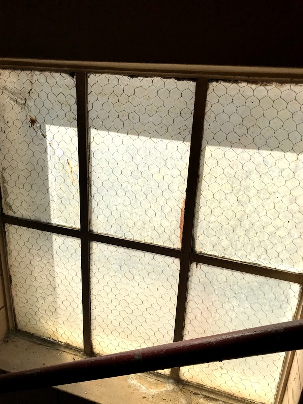
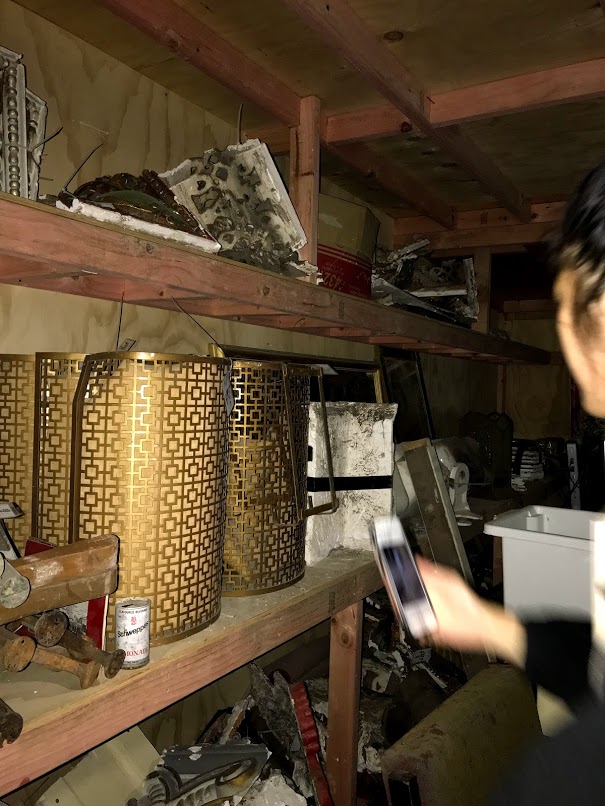
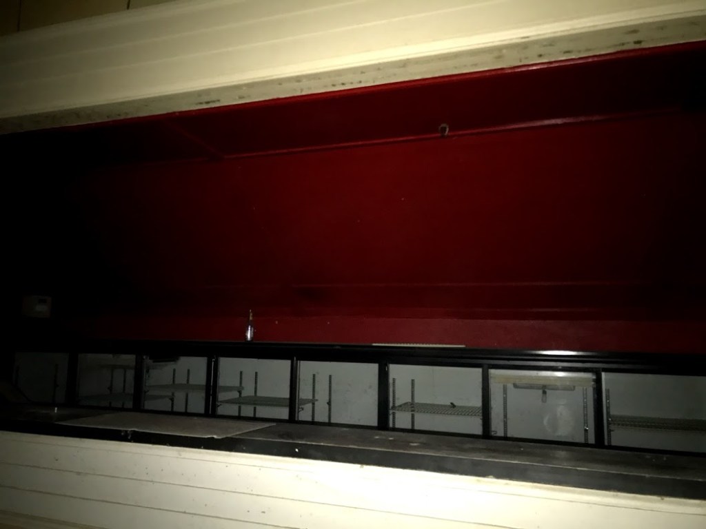
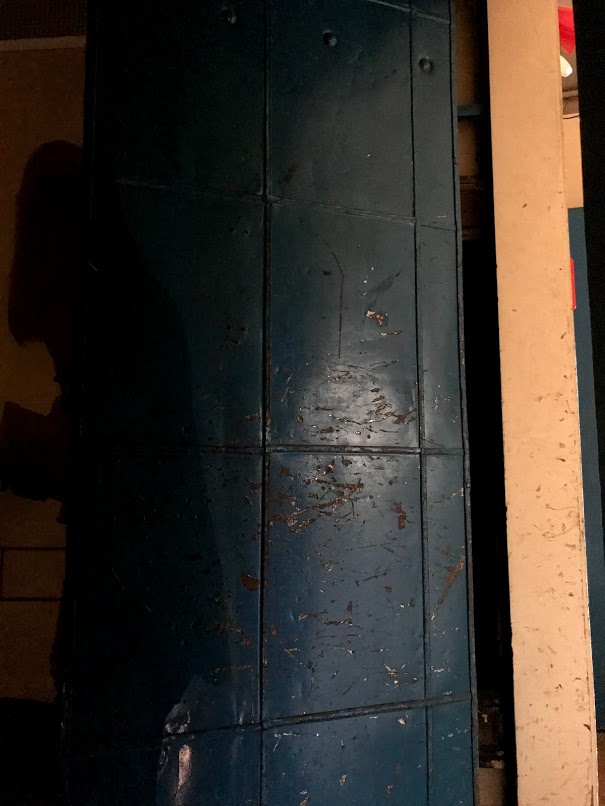
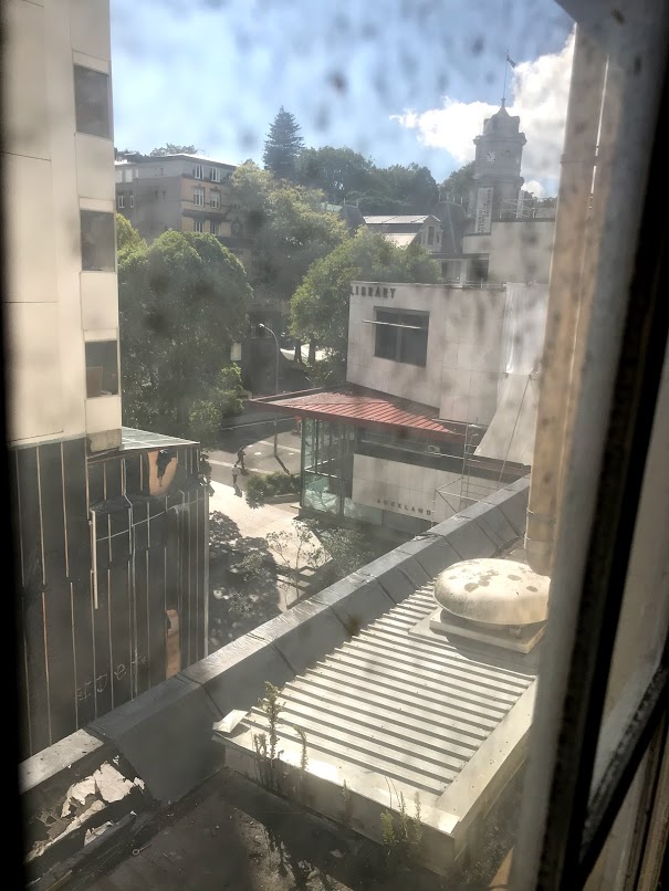
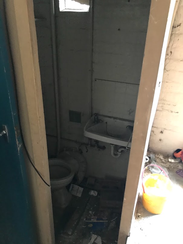
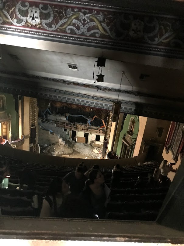
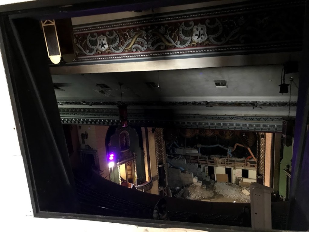
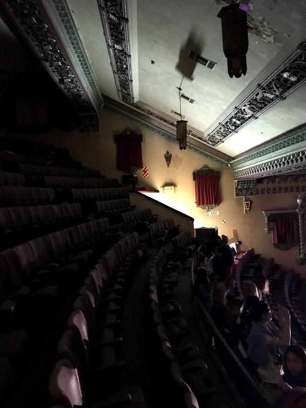
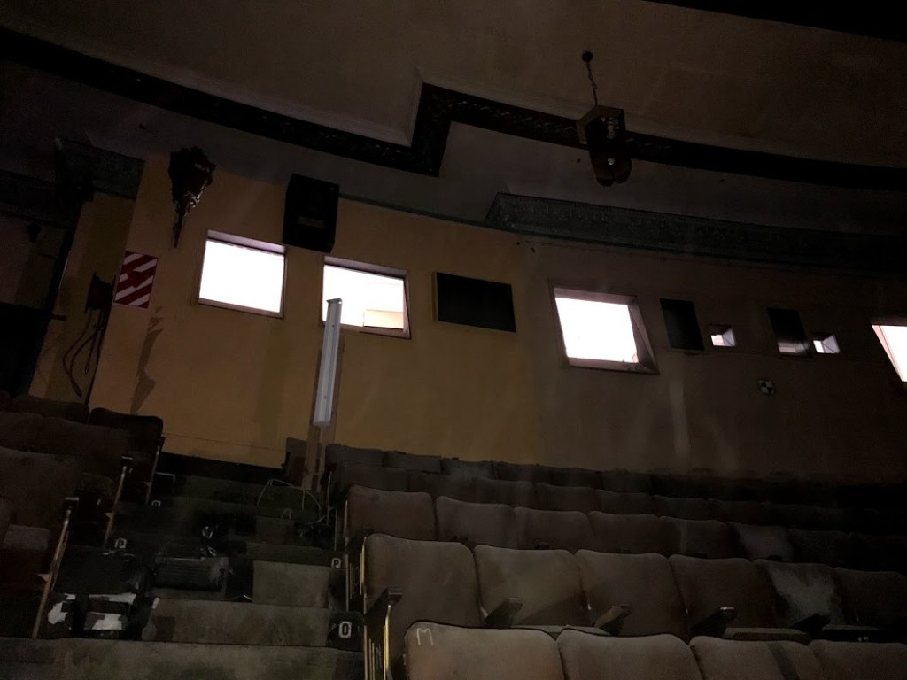
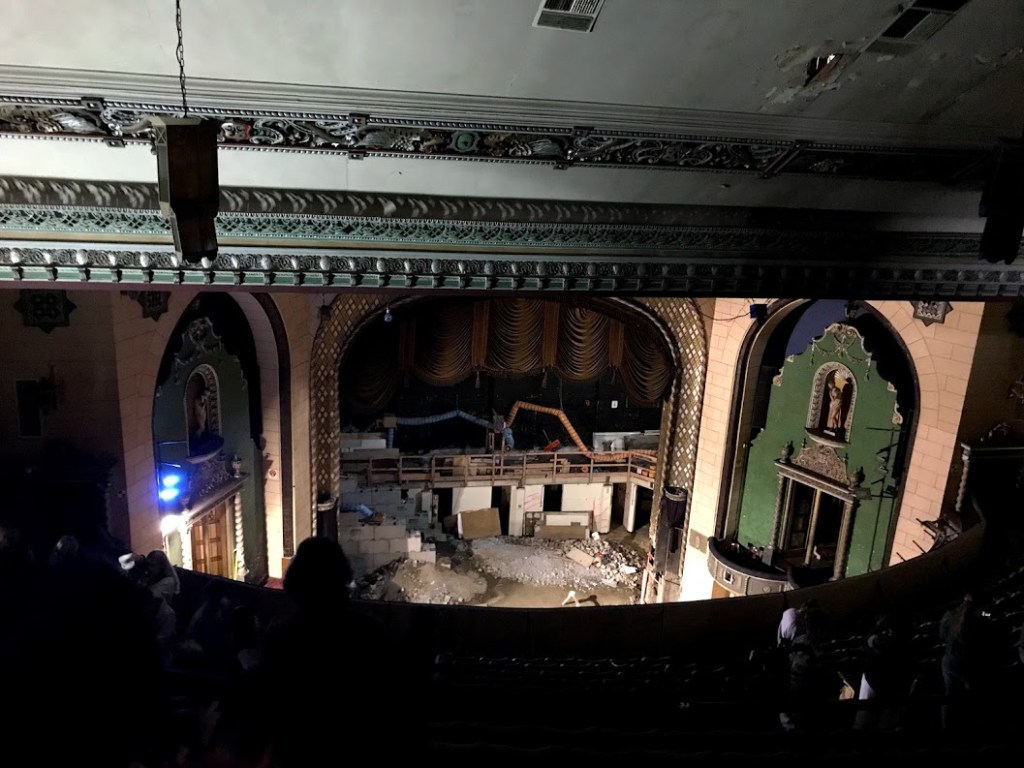
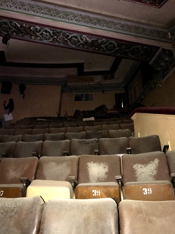
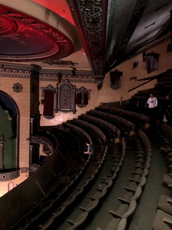
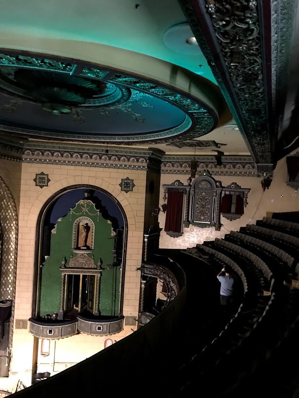
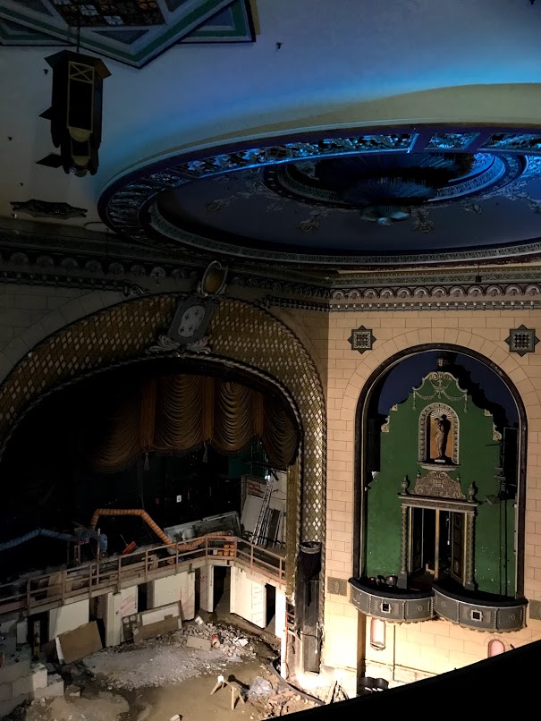
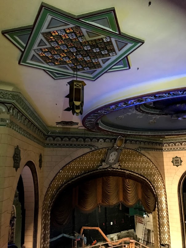
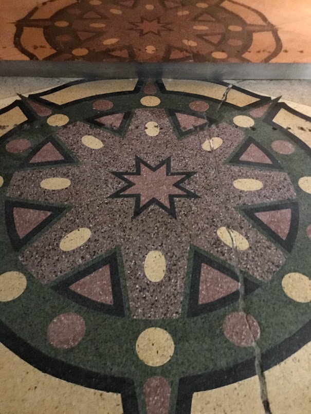
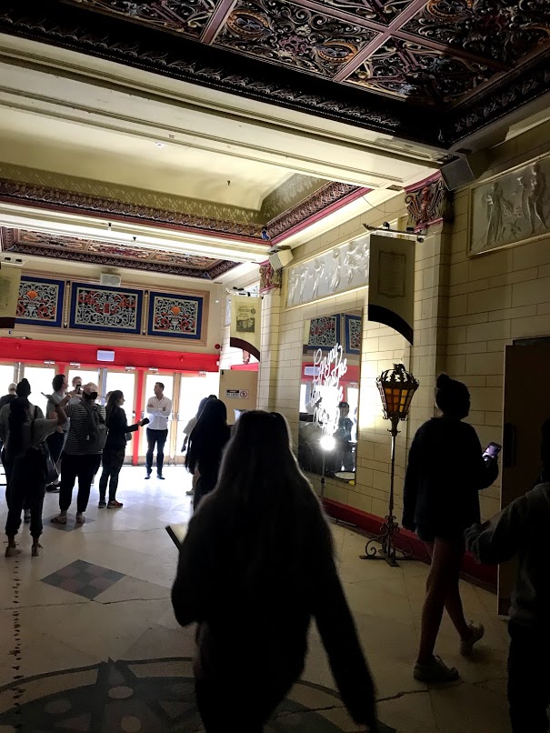
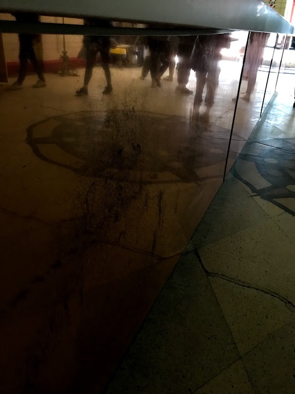
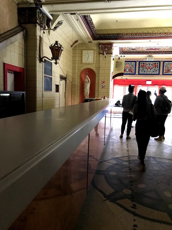
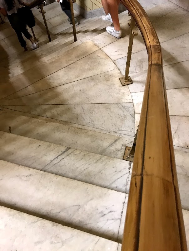
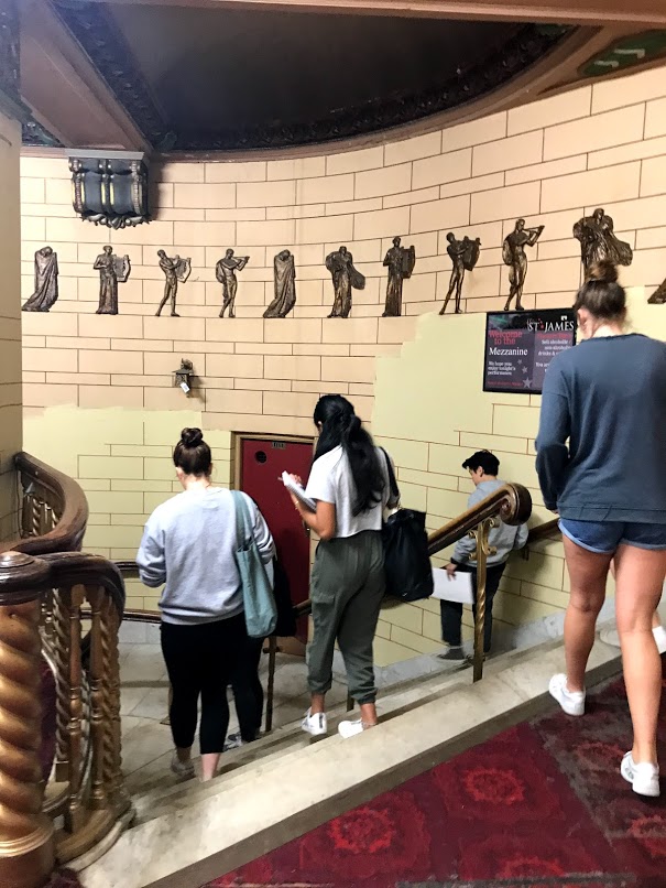
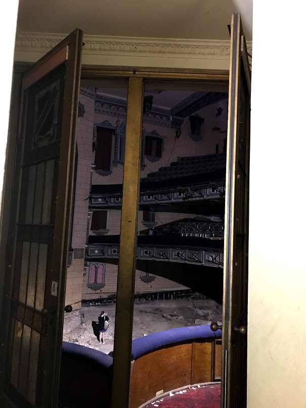
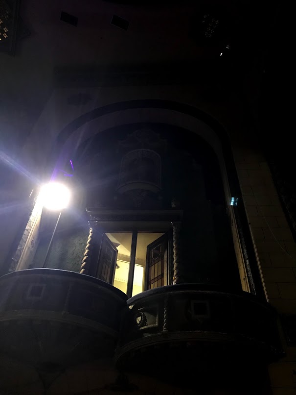
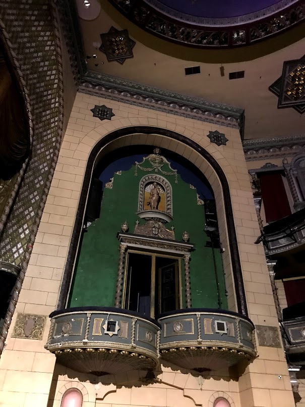
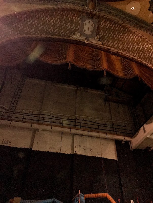
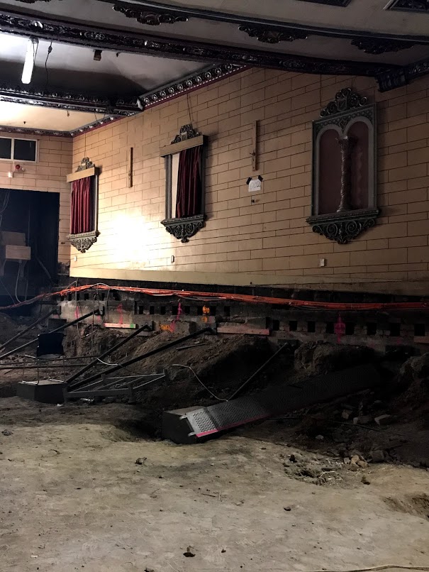
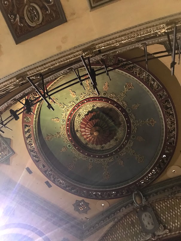
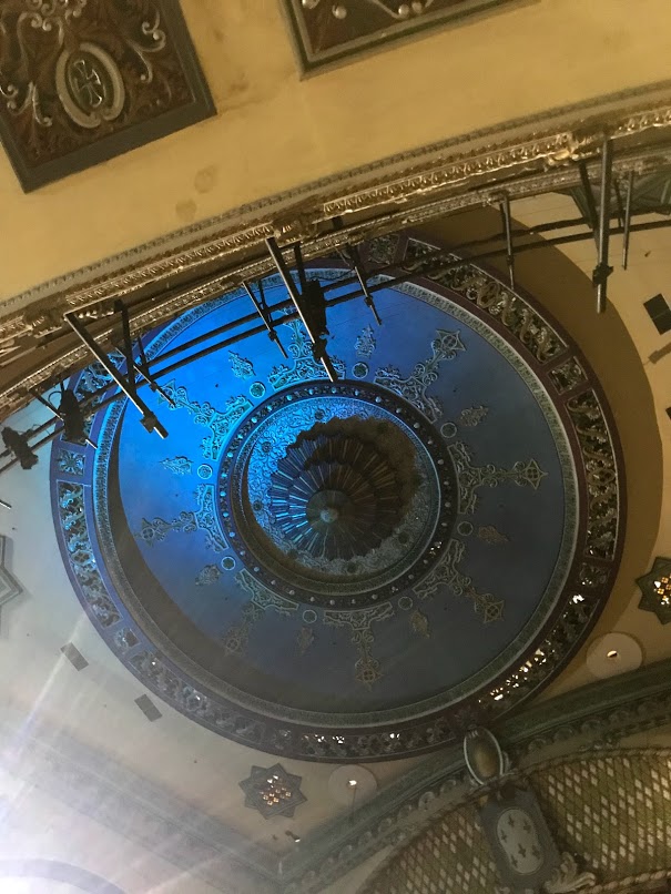
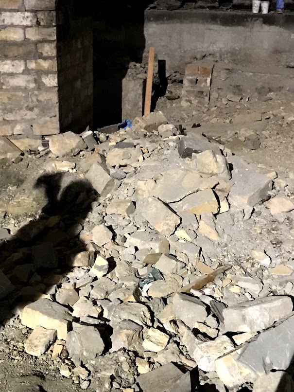
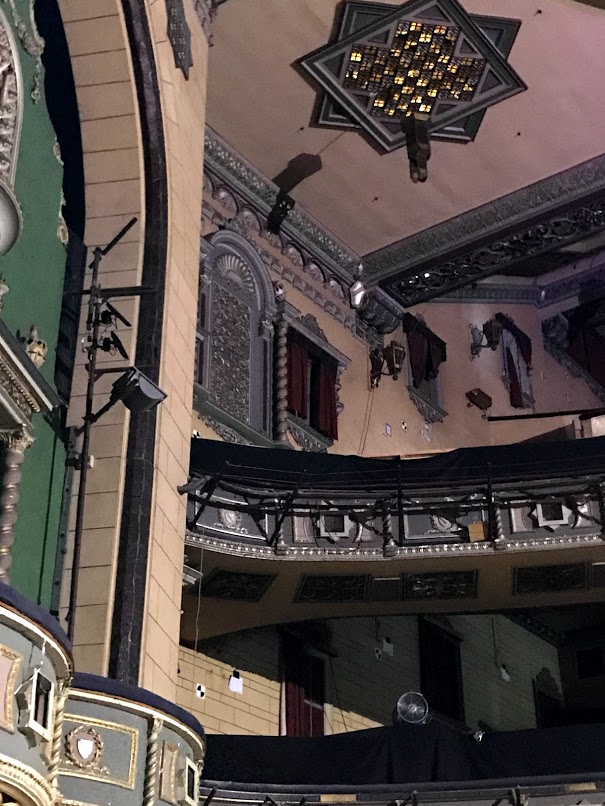
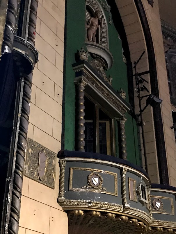
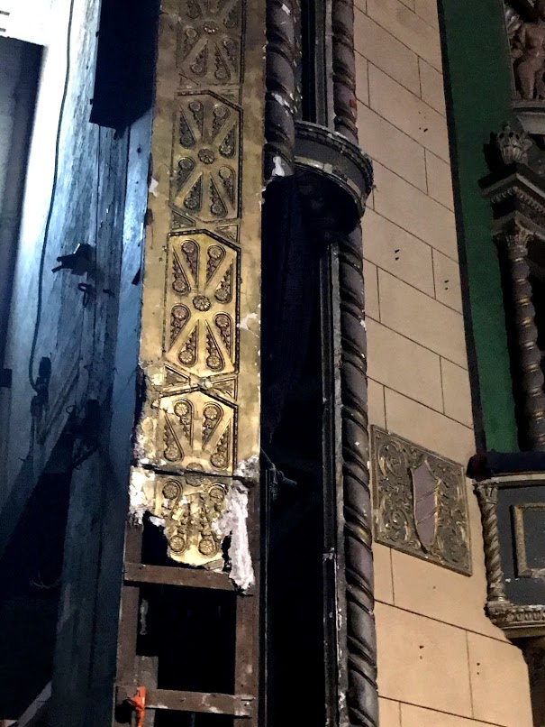
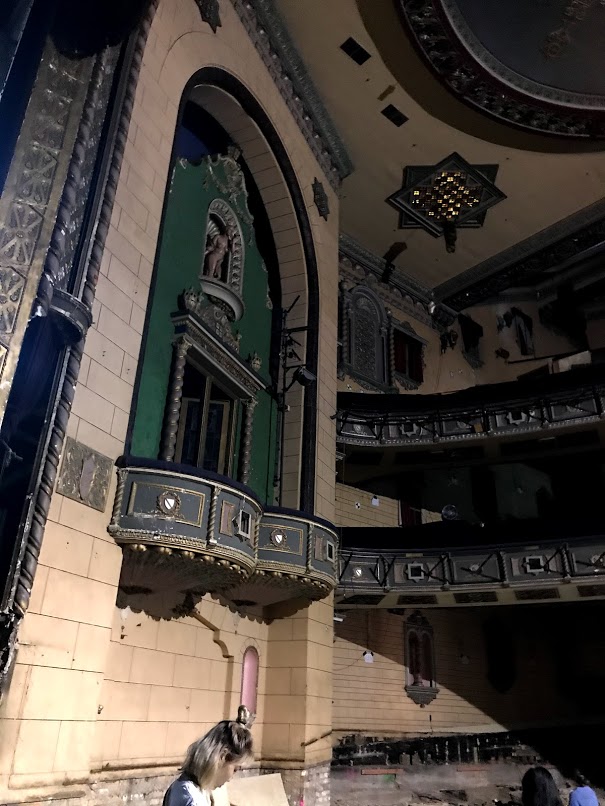
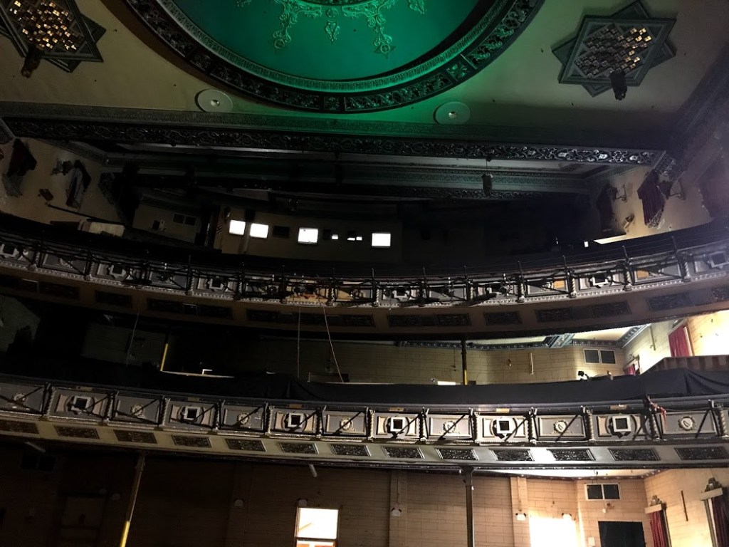
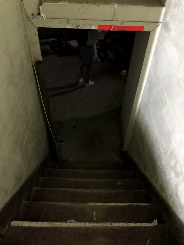
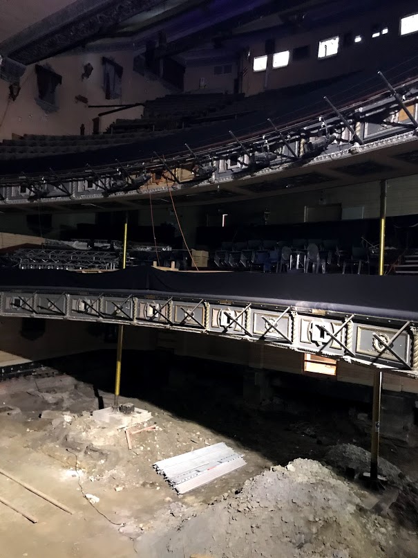
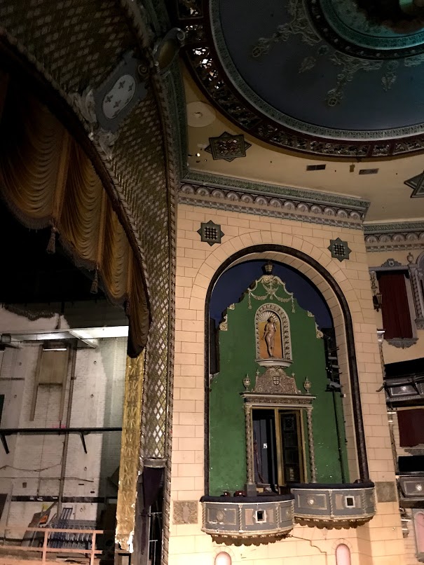
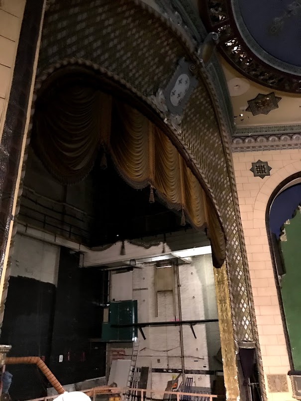
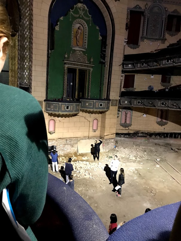
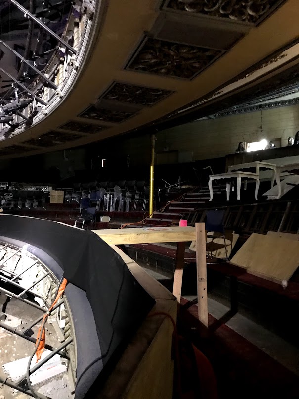
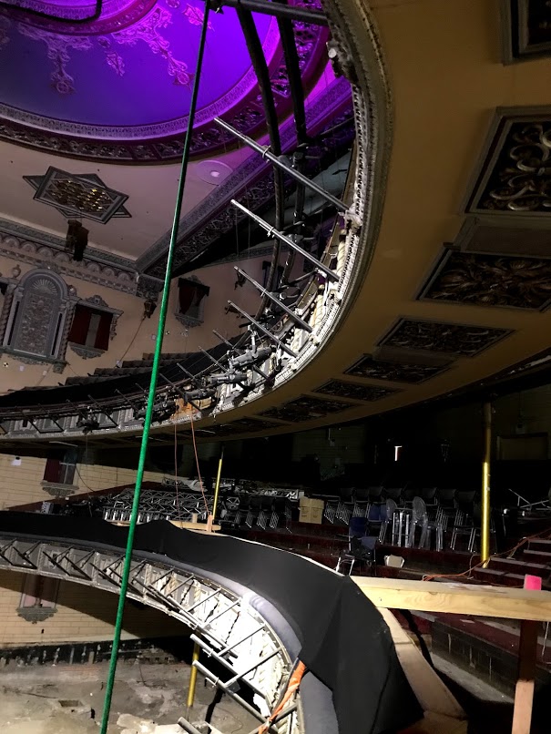
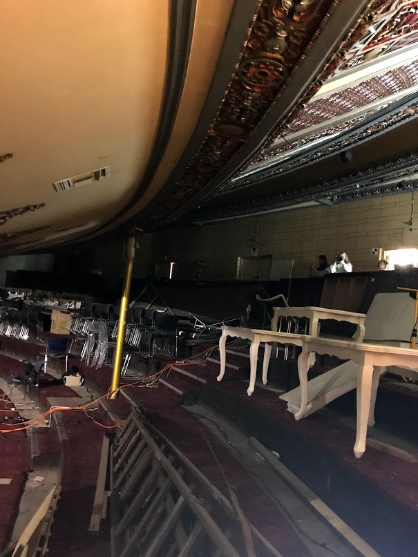
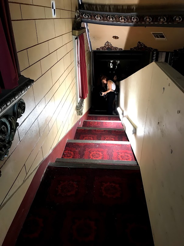
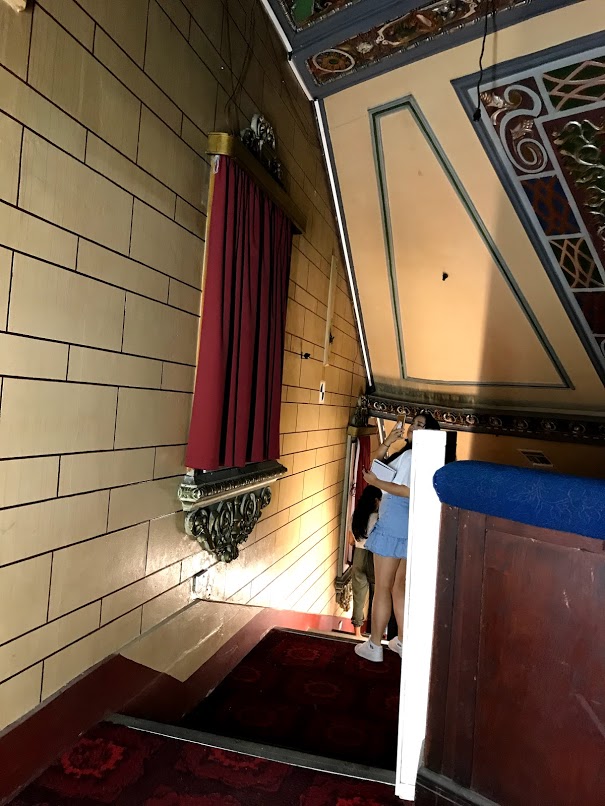
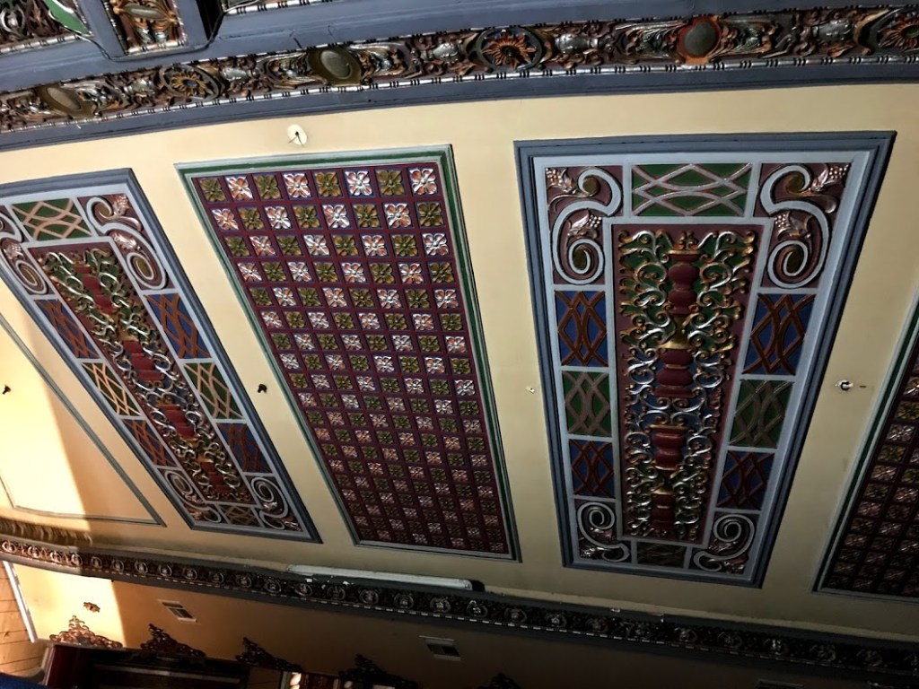
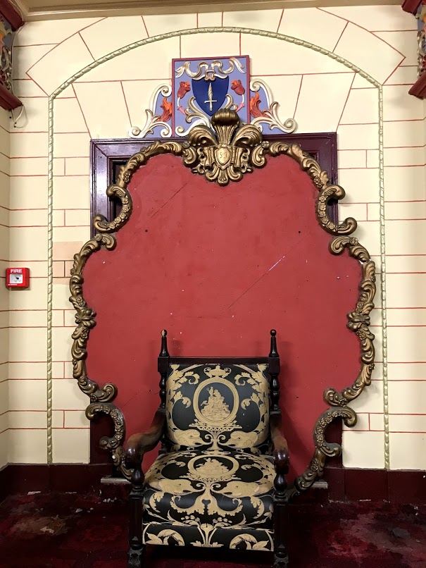
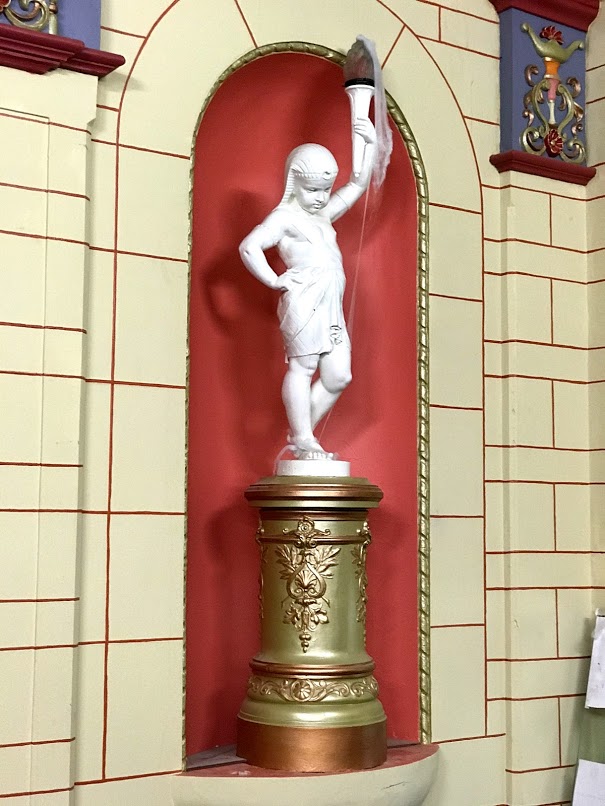
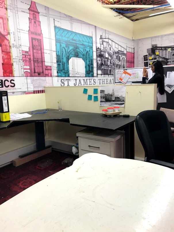
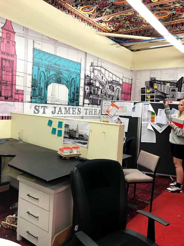
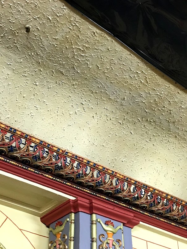
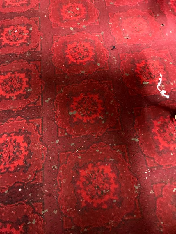
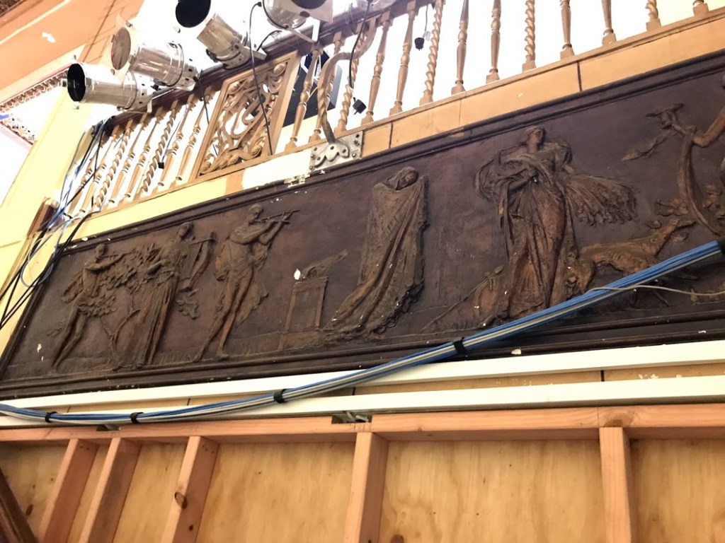
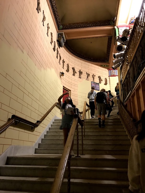
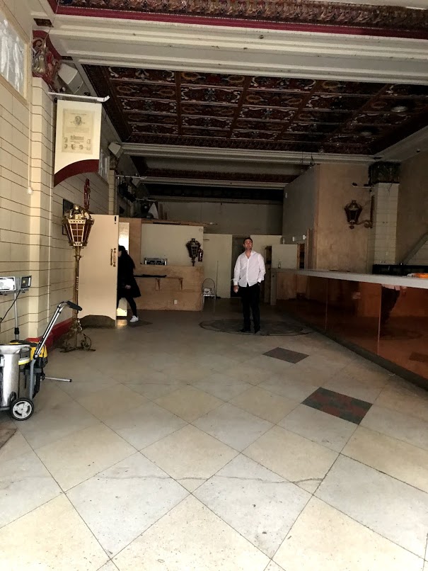
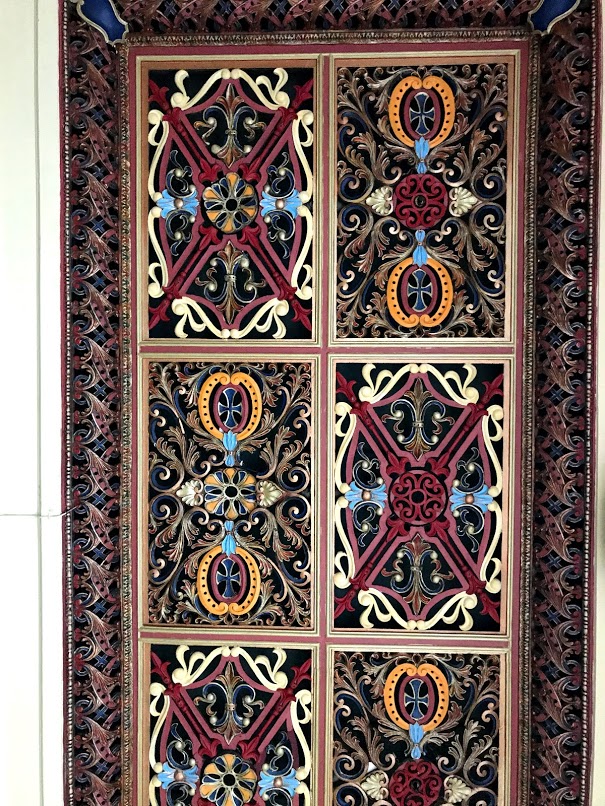
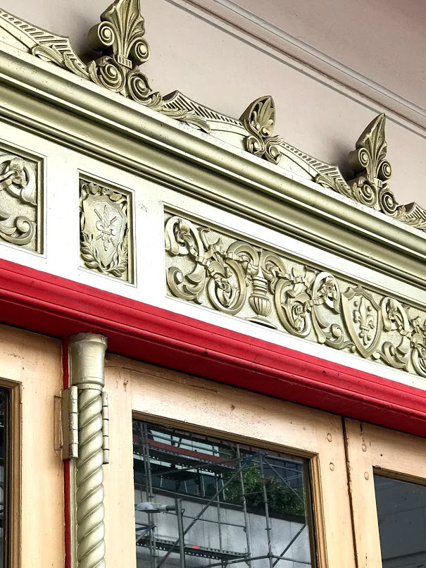
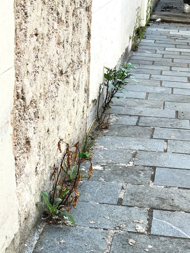
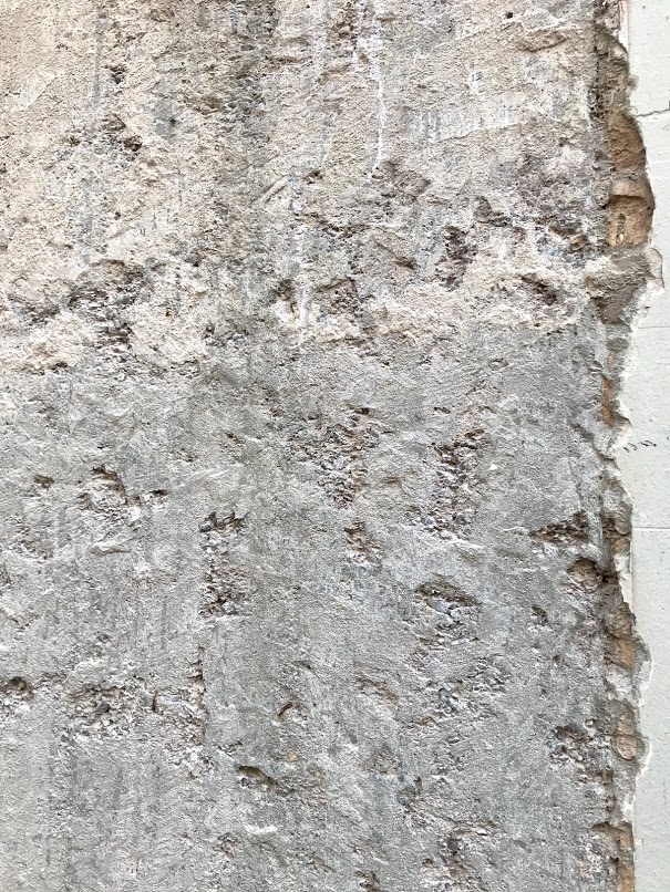
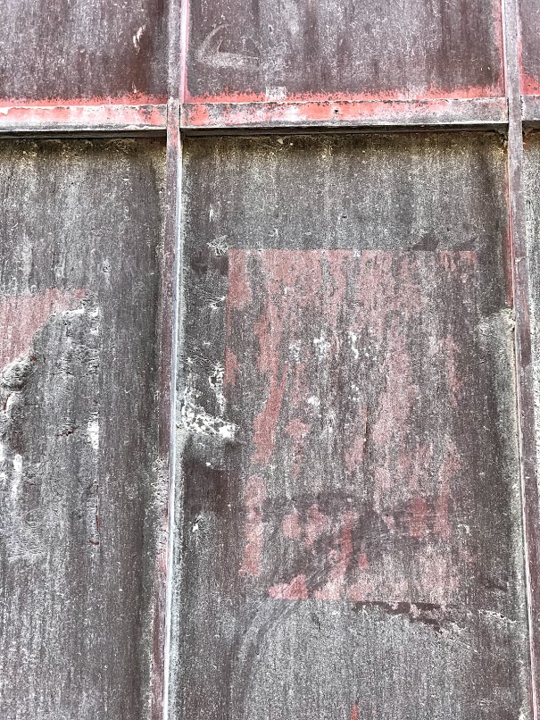
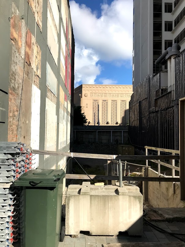
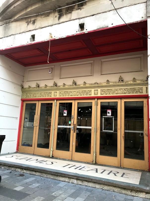
Today we went and visited the inside of the site and here are the images I have take
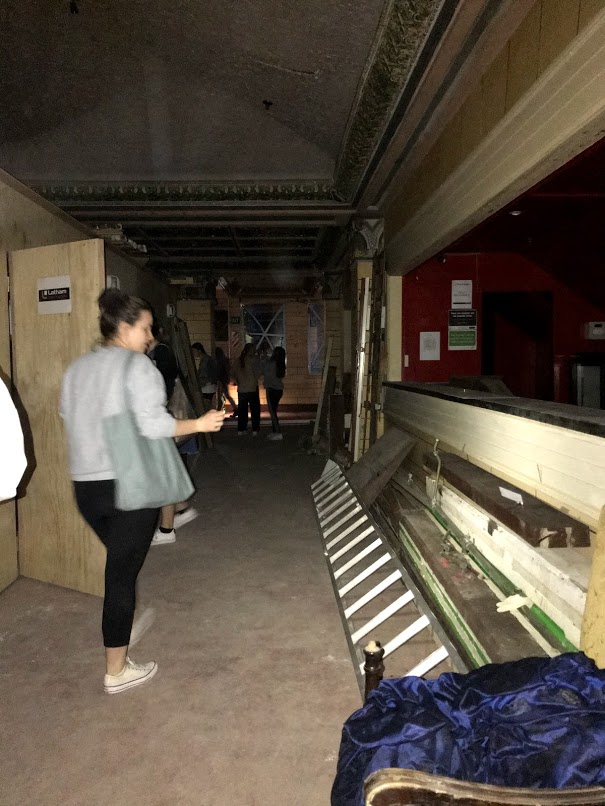
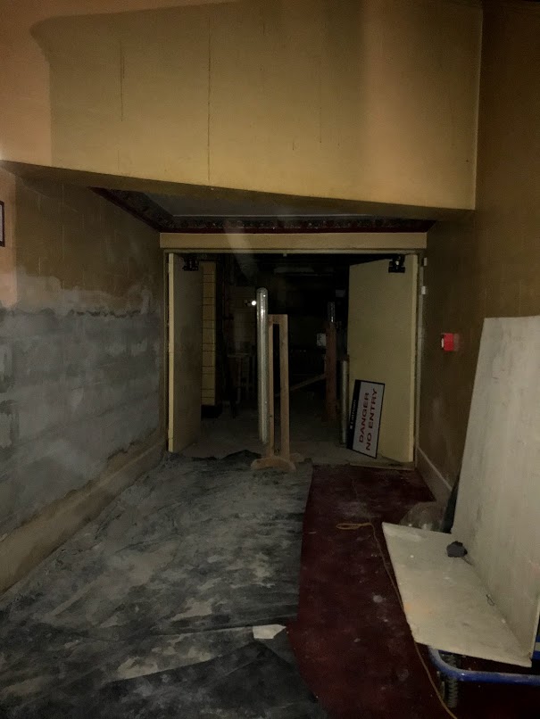
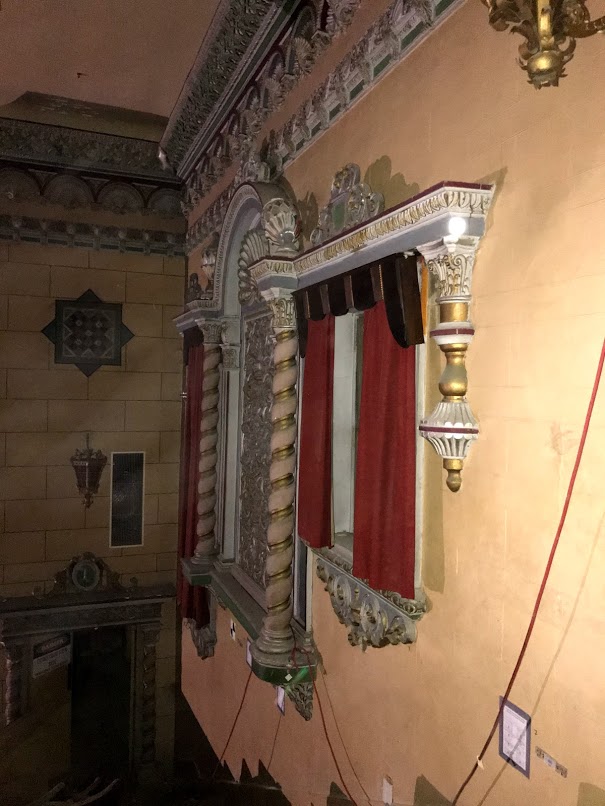
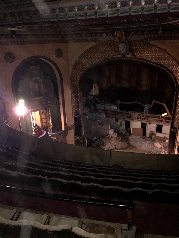
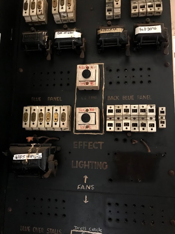
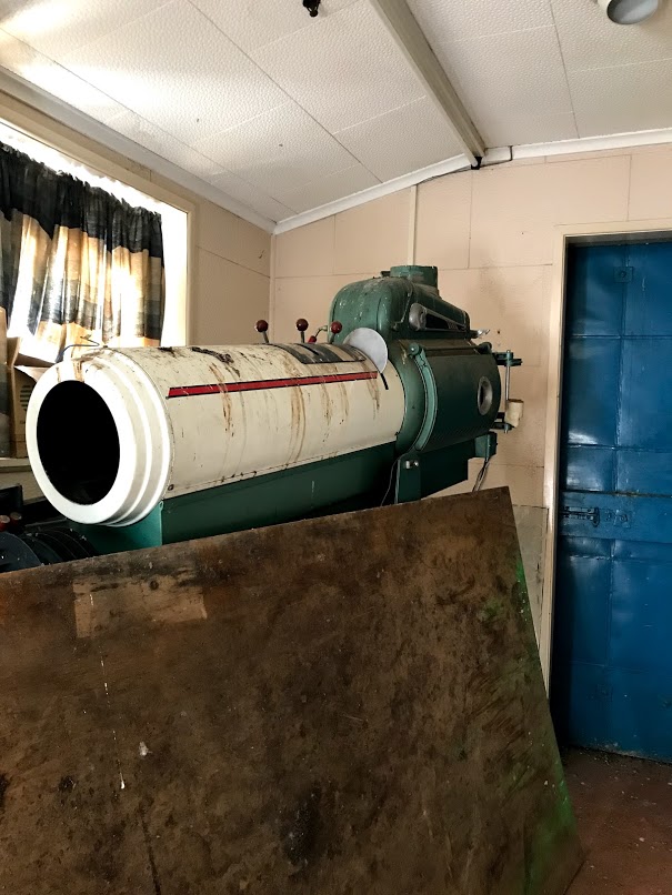
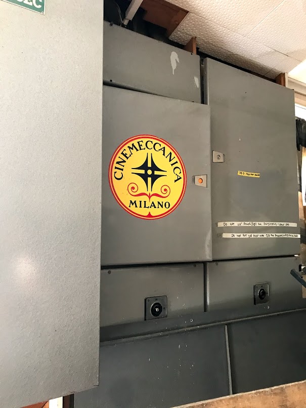
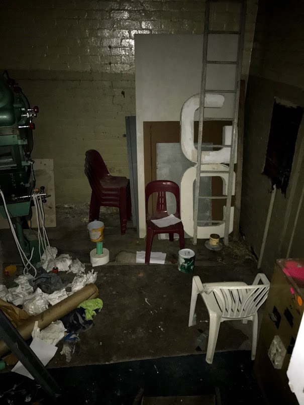
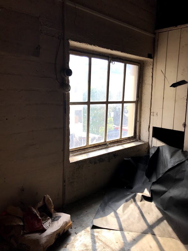
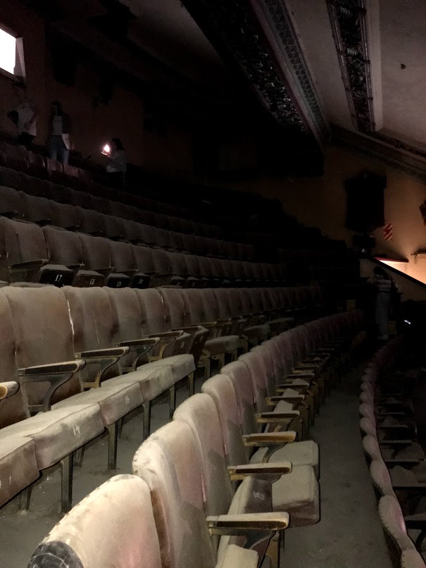
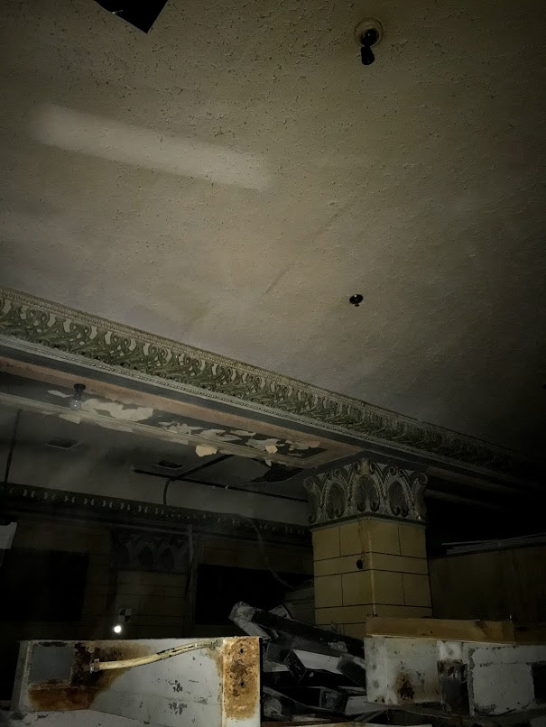
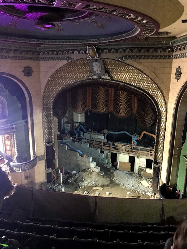
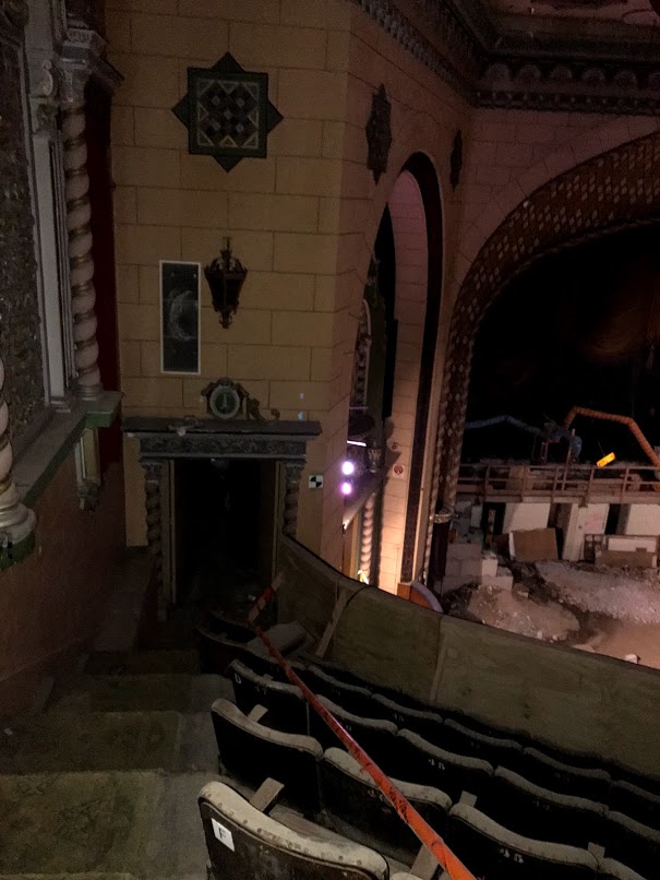
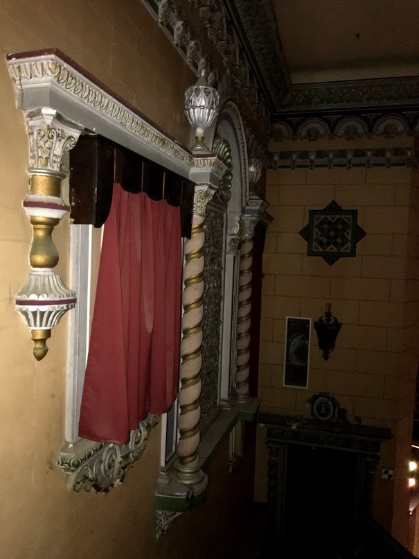
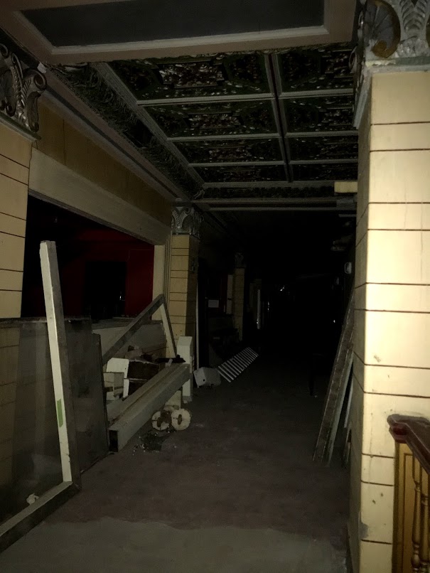
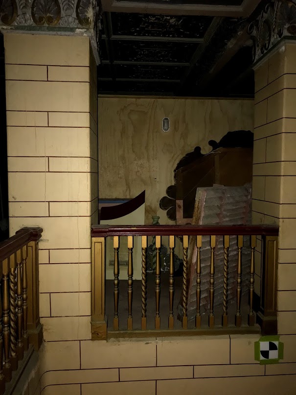
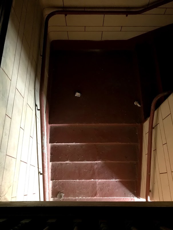
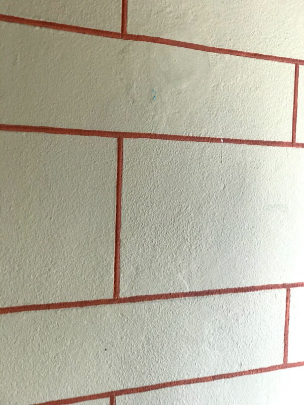
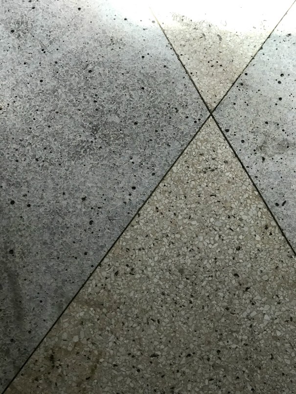
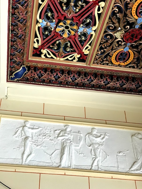
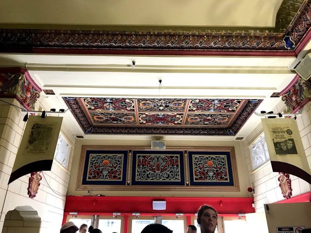
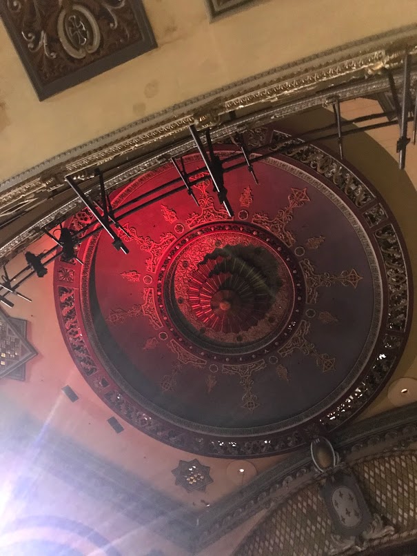
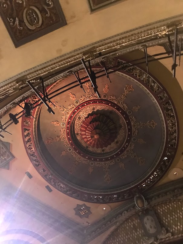
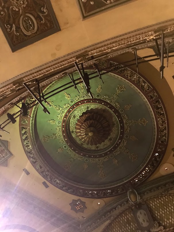
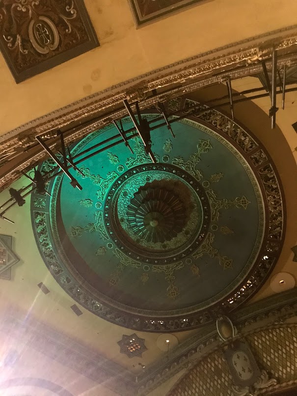
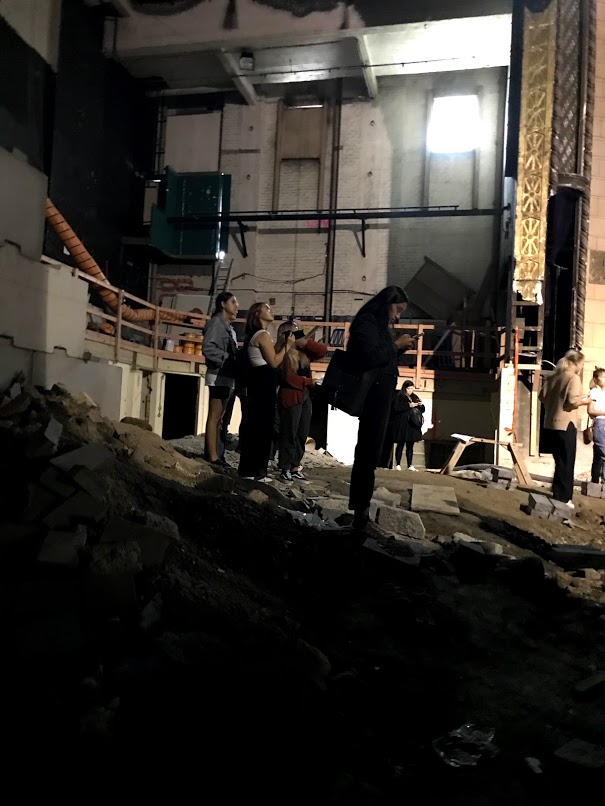
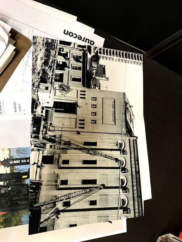
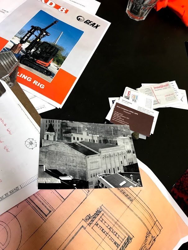
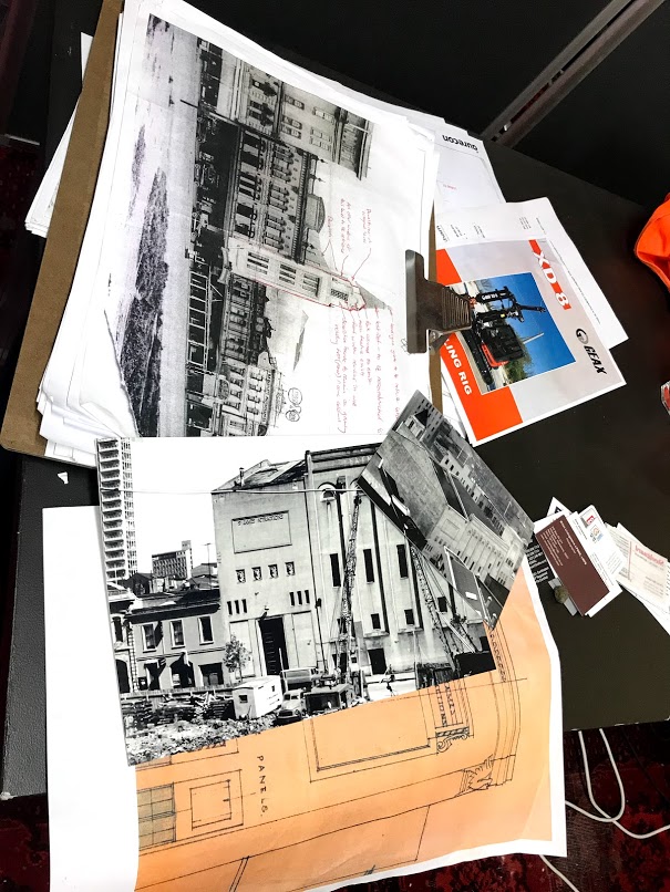
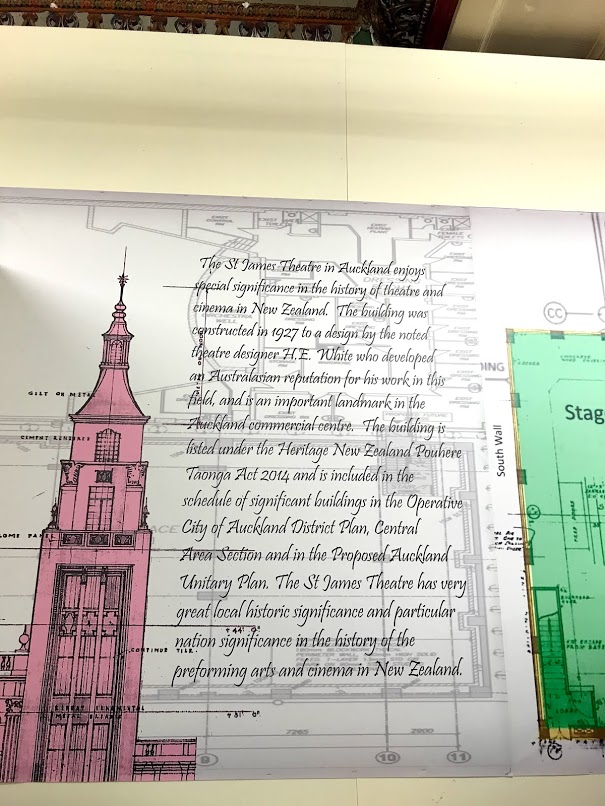
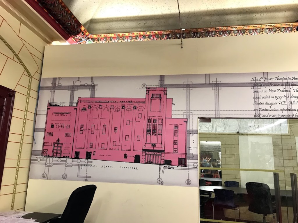
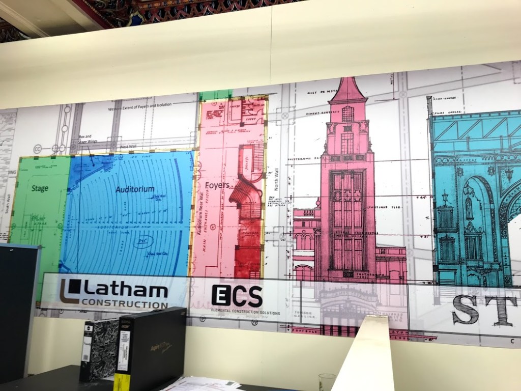
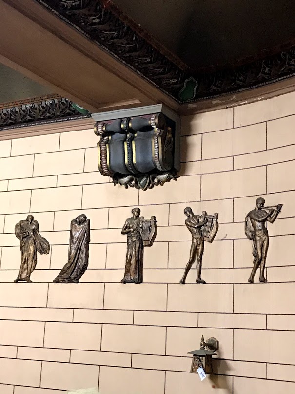
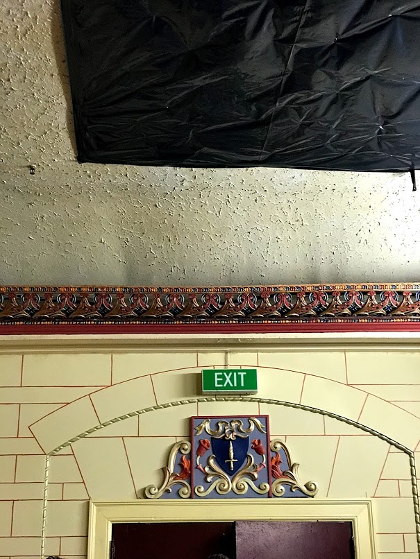
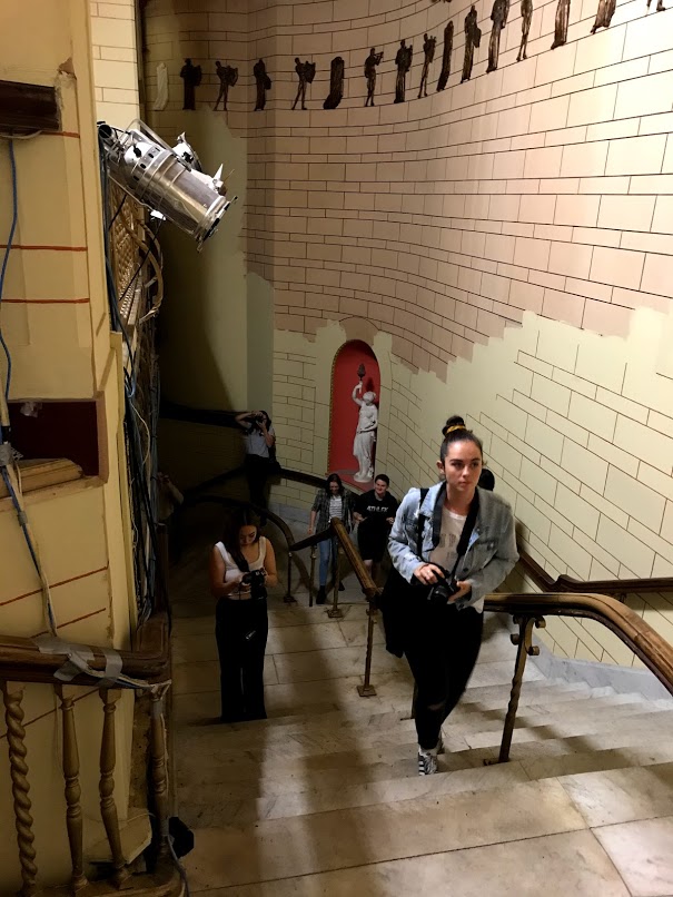
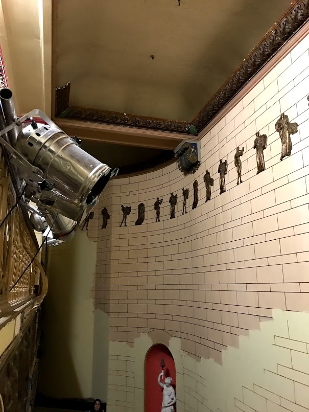
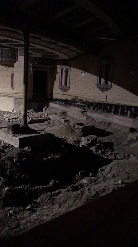
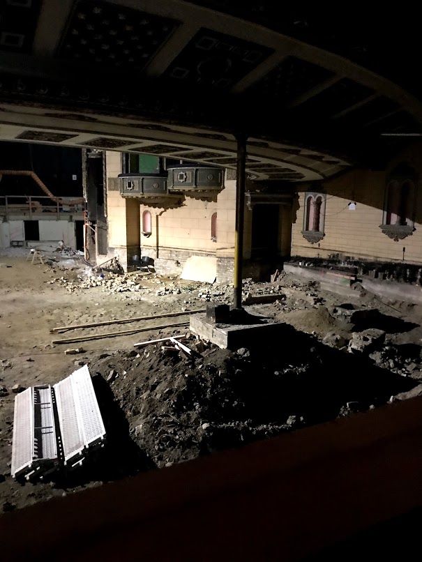
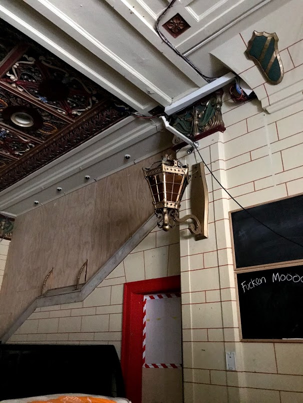
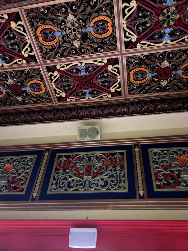
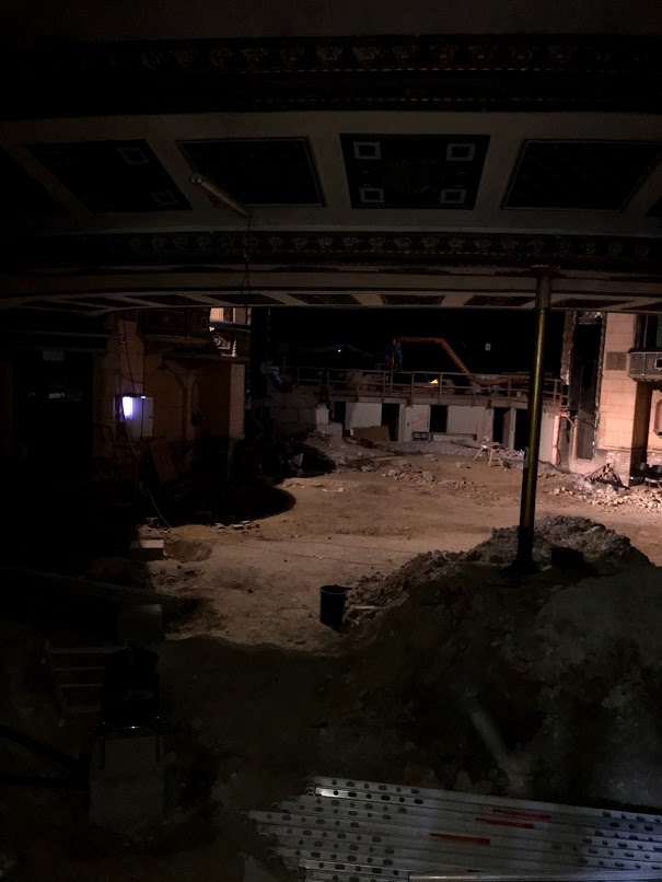
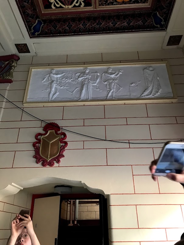
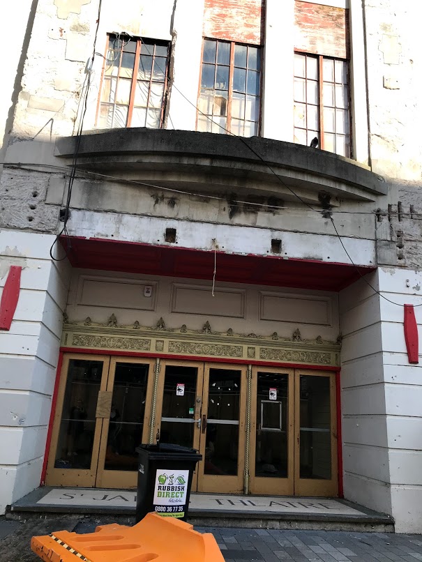
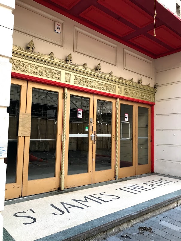
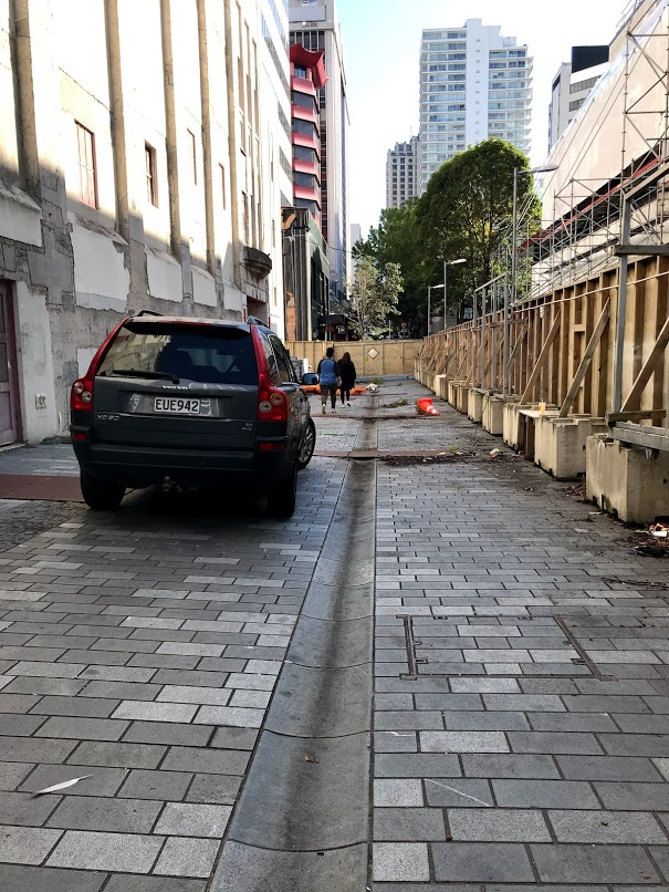
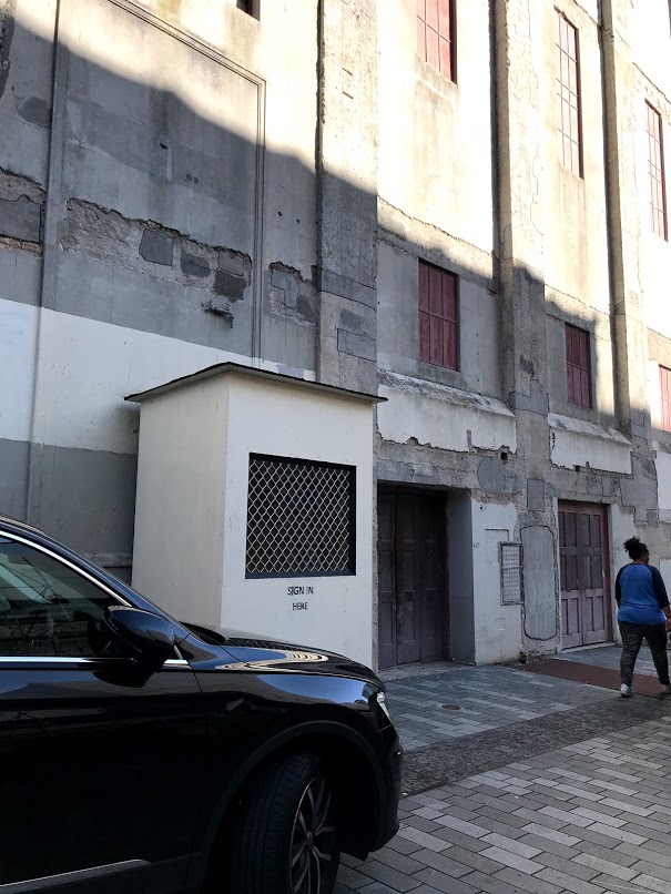
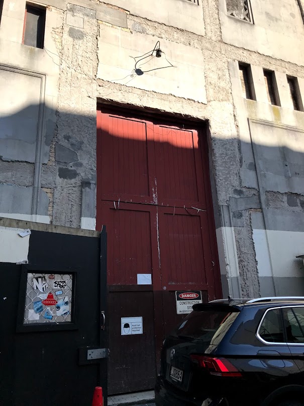
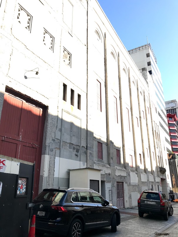
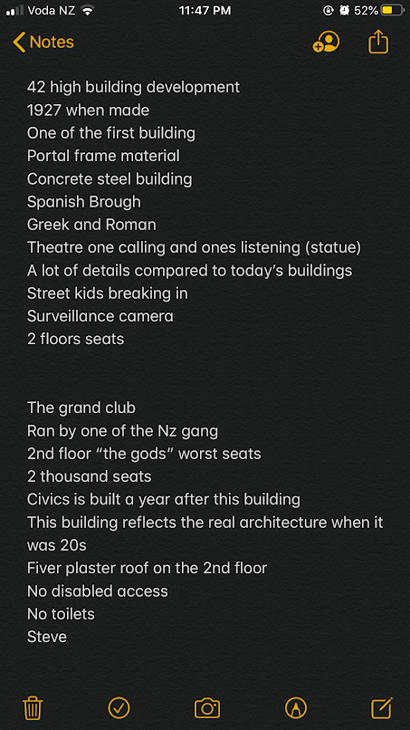
Below are the notes I have taken while we visited the site and Steve was talking about the site itself