This week we talked and had a look at about colour schemes / contrasts for our bath house and how this might appeal more for the customers. Whether your design looks appealing and well made, having the right color scheme is crucial in attaining a good impression on the customers in which it will attract more people from so.
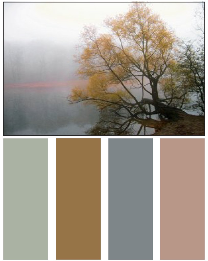
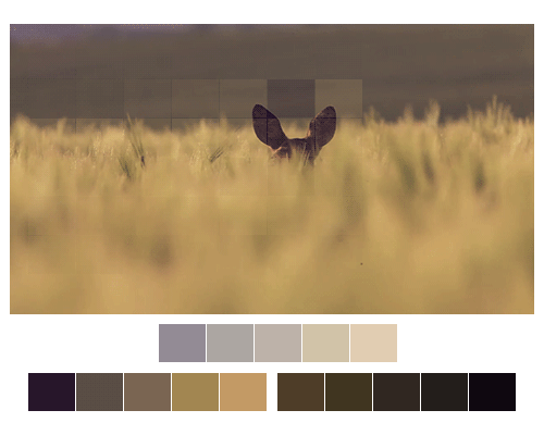
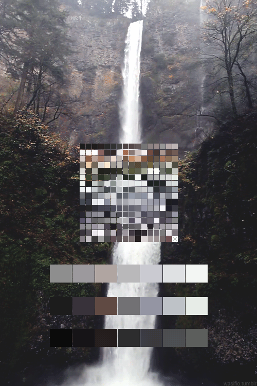
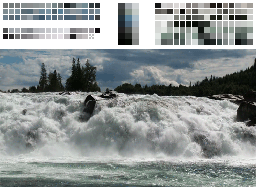
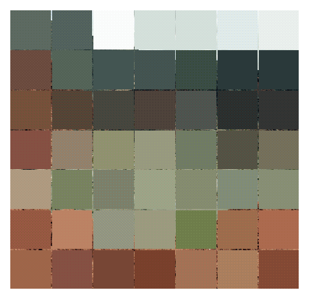
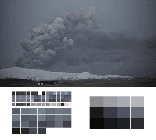
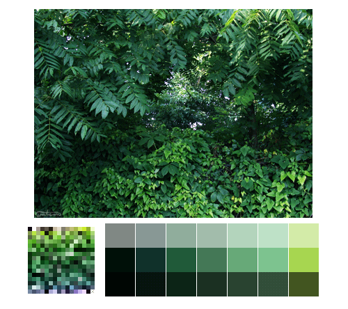
Below are a few color schemes that i have picked out, i initially wanted to stick to the color contrasts of grey with a few color of the pocket forest to my design to bring some sort of connection between the two.
Mainly the colors scheme that i have pickedout falls under the color palette of nature. Painters , designers, photographers and illustrators have used nature as a source for inspiration in their designs, color palettes and other visual work. Artists such as Van Gogh to Pierre-Auguste Renoir down to the infamous Japanese art, Ukiyo-e and the Chinese’s watercolor paintings nature has been depicted and has been used as a visual inspiration or used to provide a color palette also known as color scheme.
With tons of color palette generators present in the internet it is nice to see some awesome blogs that doesn’t just show a person a color palette but instead it shows the color palette together with the image or the scene where it originated from.

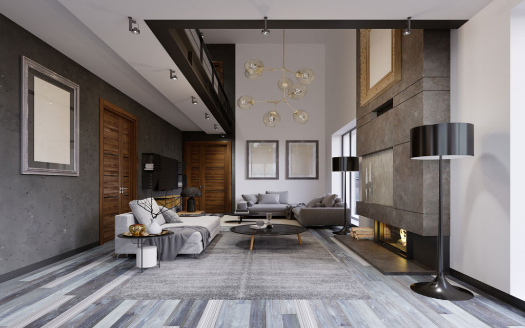
In conclusion i have decided i wanted my interiors to have the color chart of wood and concrete to it.
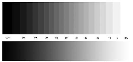
The color that i have chosen for the concrete are the nuetral colors, judging from the grey color chart it is from 50 to 70.
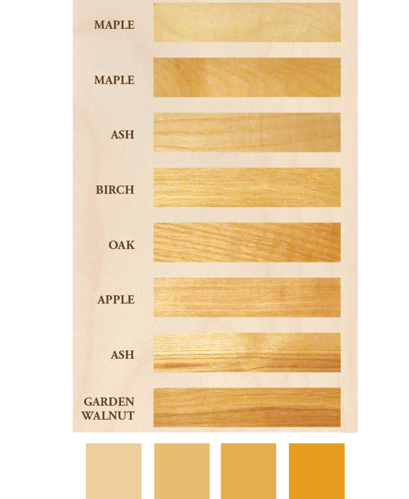
For the wood i wanted a selection between the light wood color chart (orange selection), below shows the light wood color shades that i may want for my bath house: